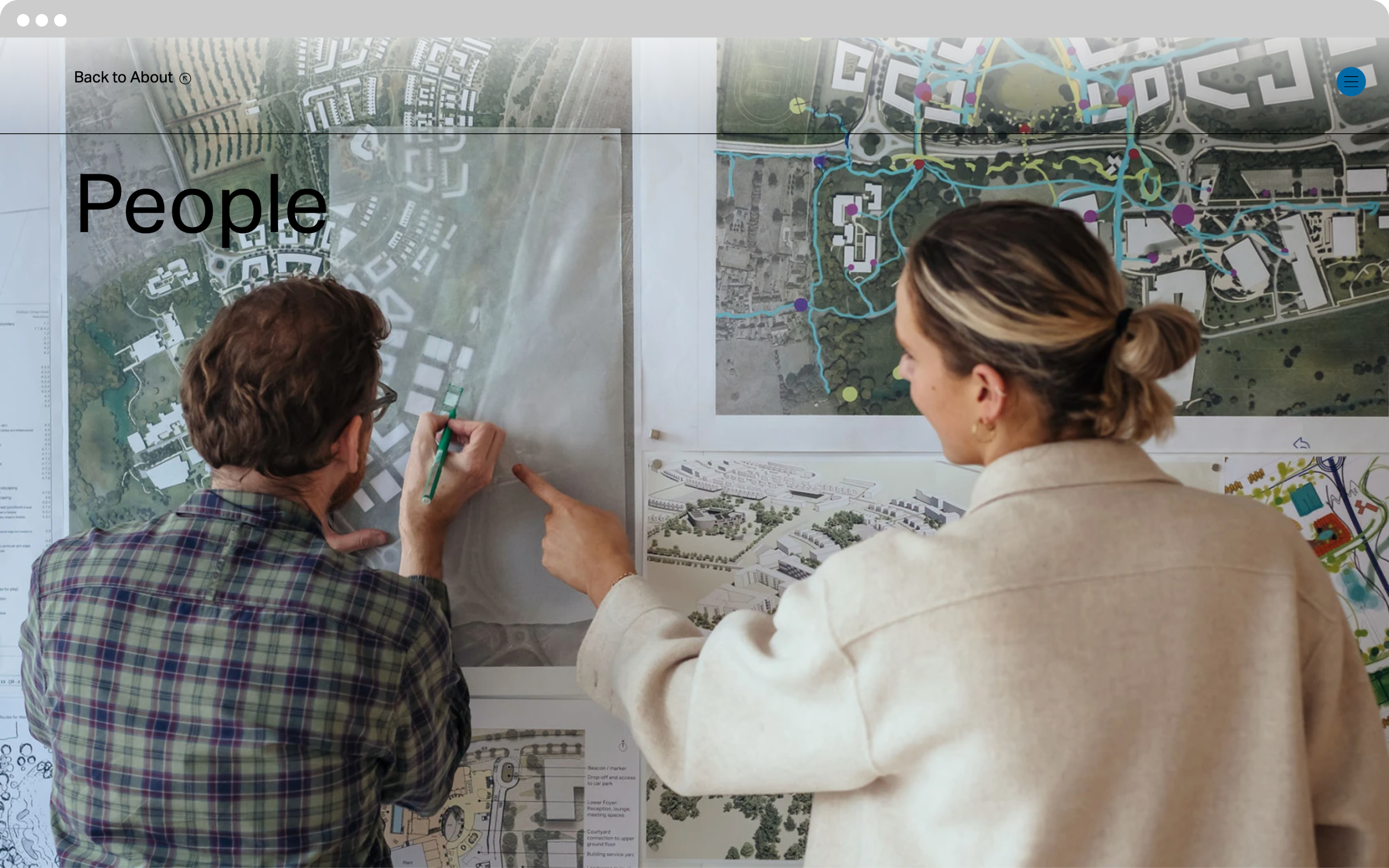
WilkinsonEyre
The creation of a best-in-class website, for a best-in-class architecture practice.
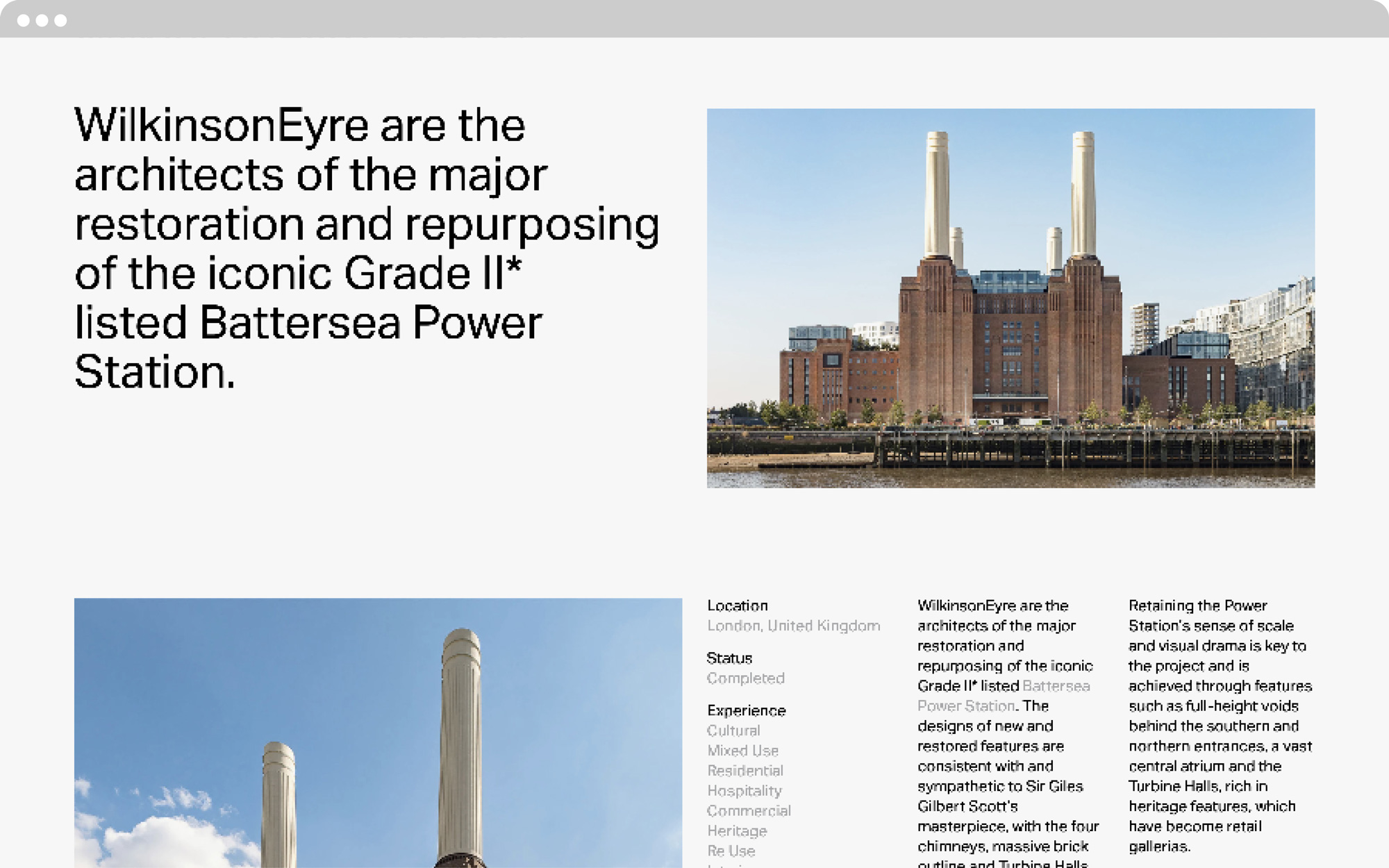
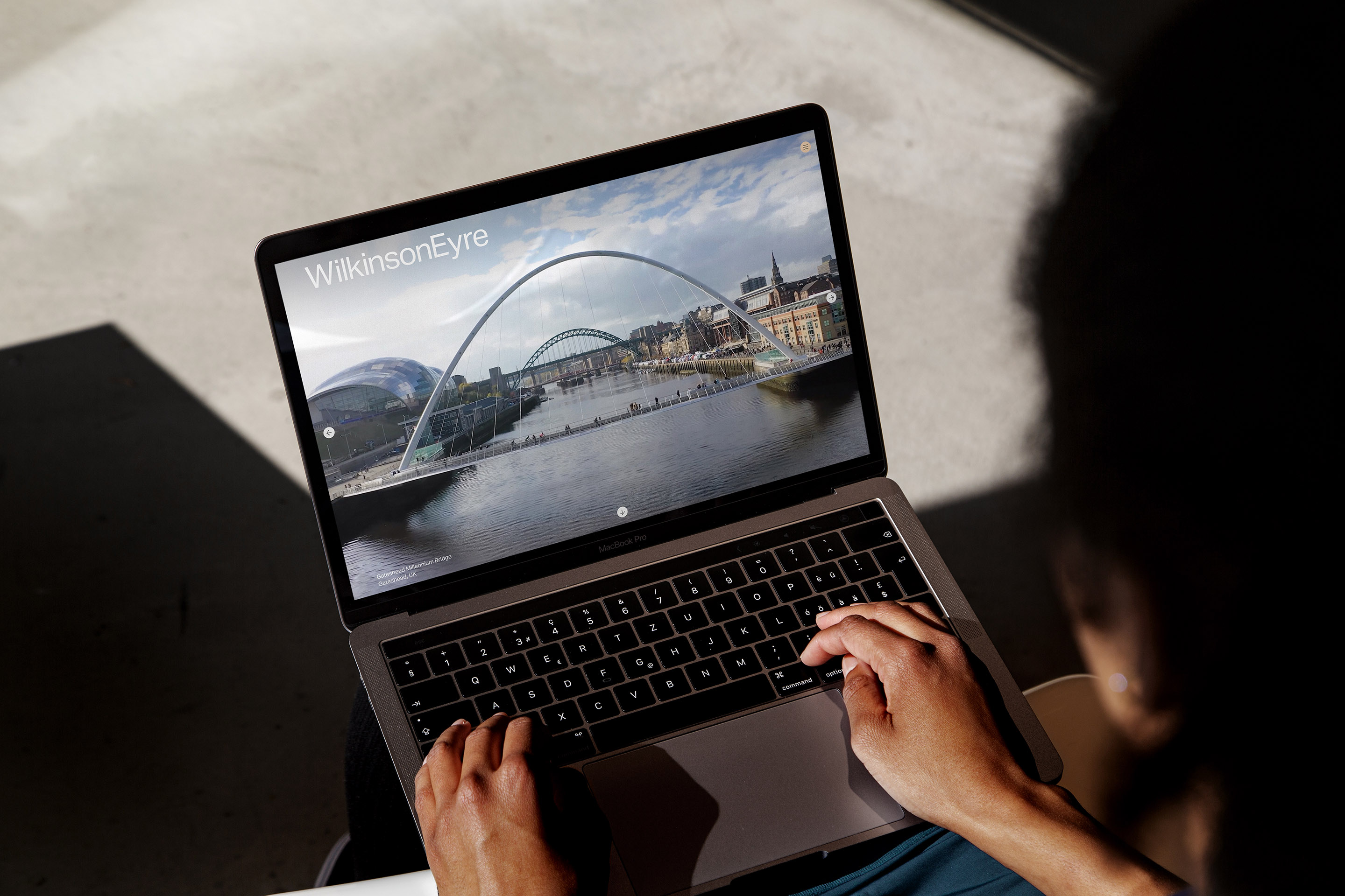
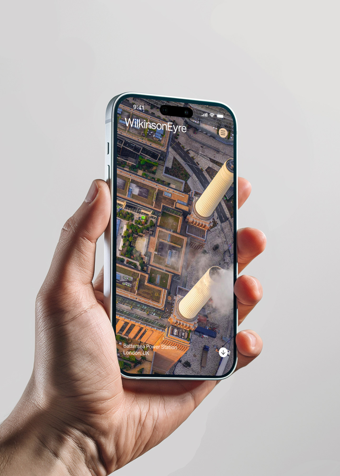
WilkinsonEyre have built some of the world’s most recognisable landmarks, including the restoration and repurposing of the iconic Battersea Power Station. Our primary objective was to deliver a best-in-class website for a best-in-class architectural practice.
The WilkinsonEyre portfolio, is informed by the unity of technology and materials, combining a commitment to the ‘spirit of the new’ with a strong grounding in context. The WilkinsonEyre identity, a setting of the Aktiv Grotesk typeface, embodies this ethos. The website aesthetic is purposefully stripped-back, putting focus on projects and navigation.
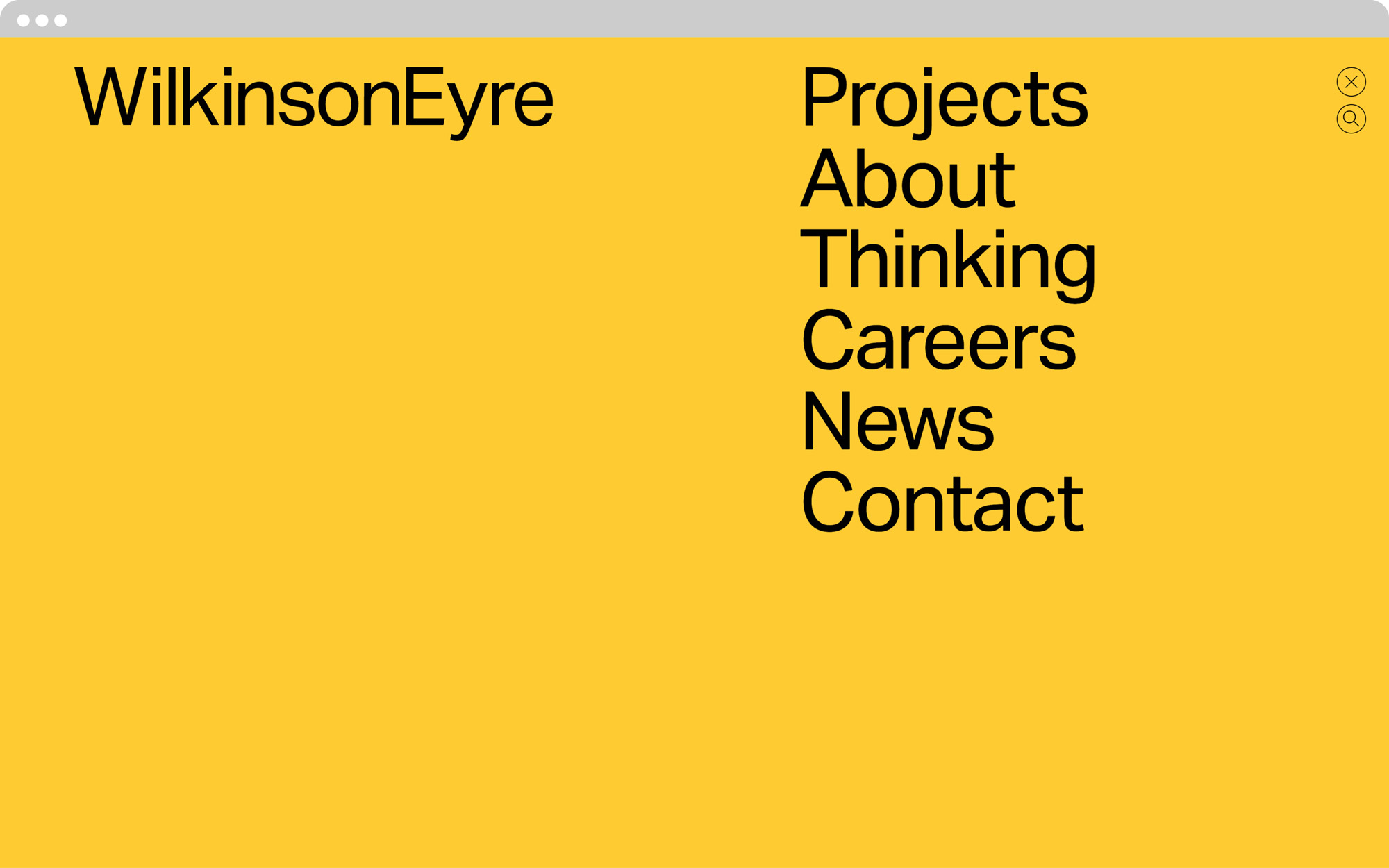
We added impact to the design through a selection of vibrant colours, inspired by the practice’s portfolio, a new icon set and a series of page styles that emphasise project work through the use of video, imagery, contrasting typography and negative space.
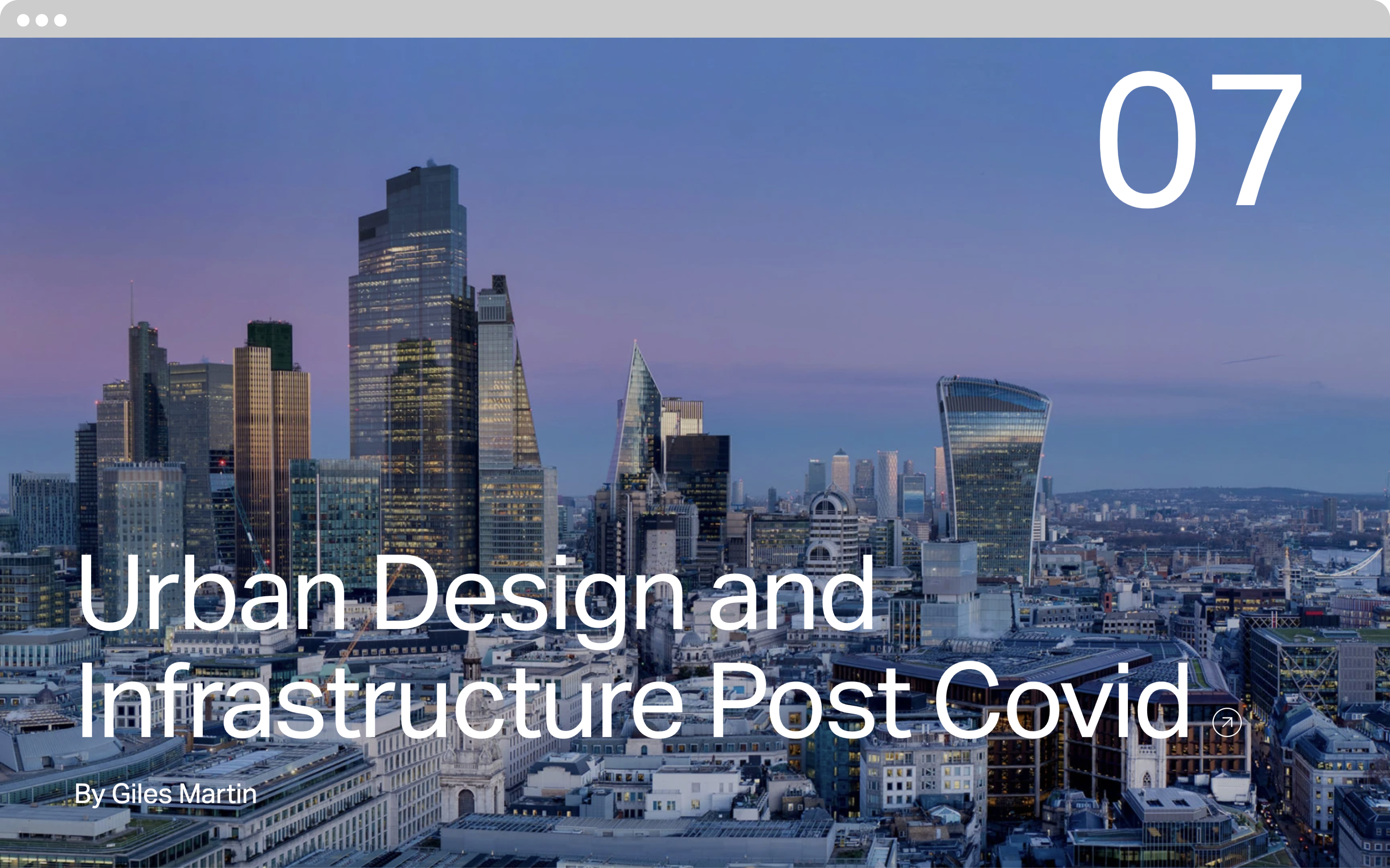
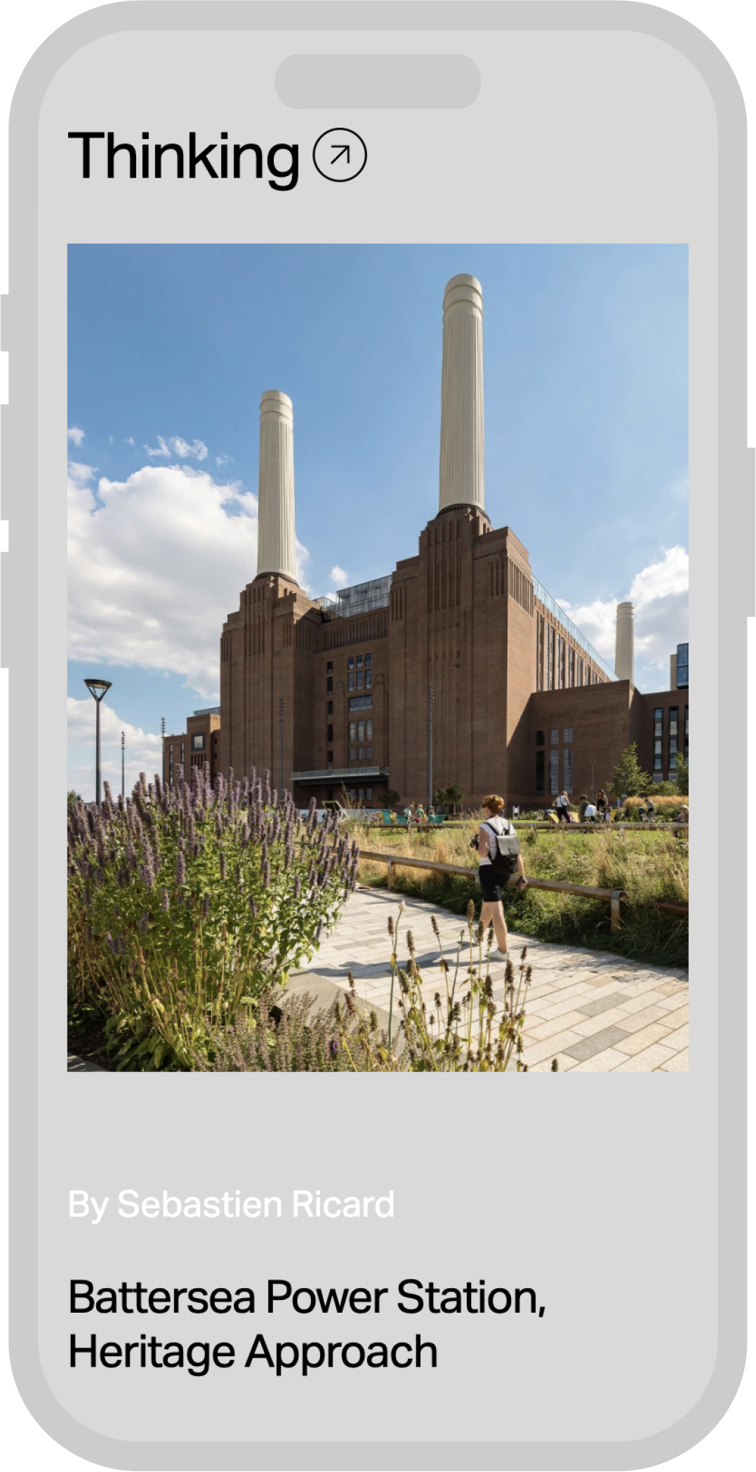
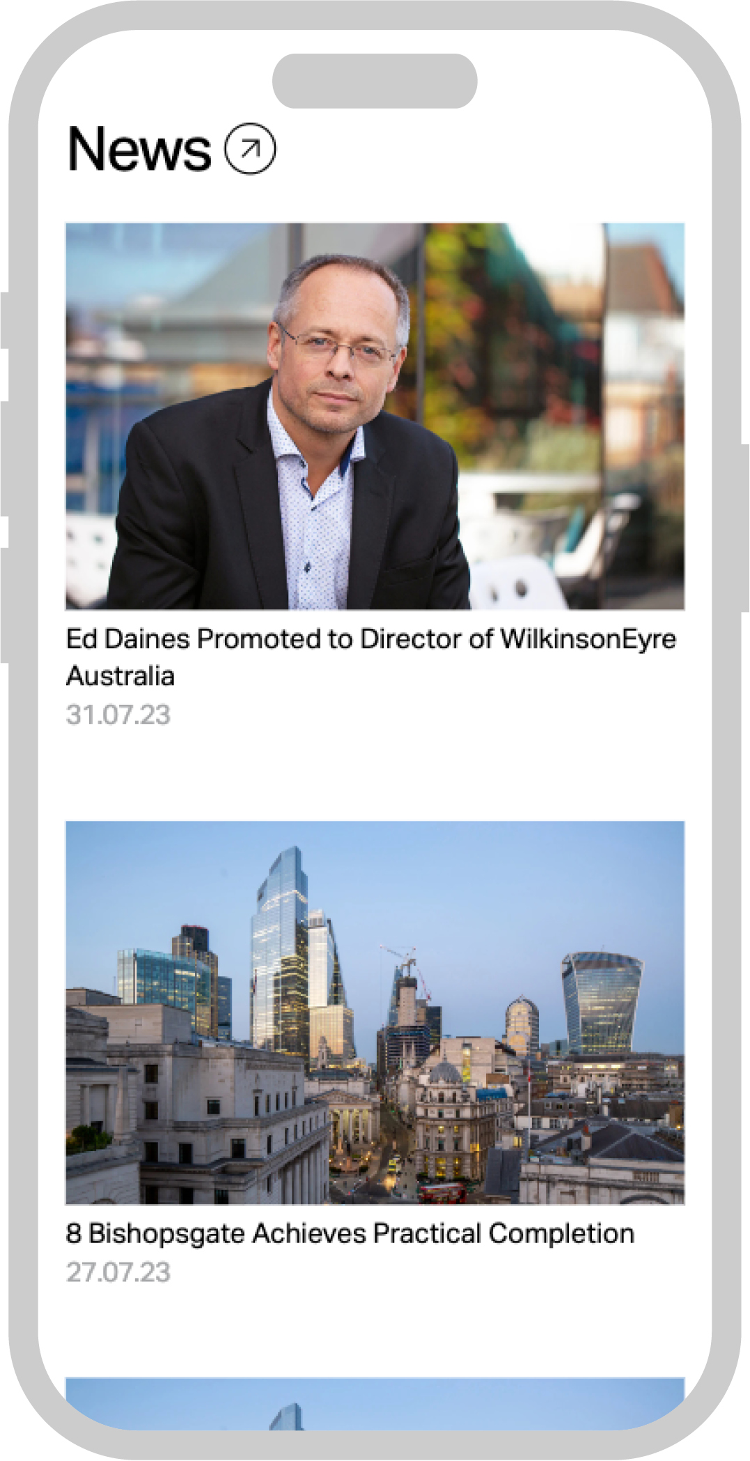
A key feature of the new site came about through an observation of the old website, which the majority of users visited to see specific projects. TM employed strategies within these pages to encourage the discovery of other areas of context relevant content — such as long-form written pieces housed in the Thinking section of the website.The Thinking section focuses on article themes, drawing disparate archive projects together, that would otherwise be undiscovered. The Thinking section exhibits the strength and depth of the practice’s broad portfolio in a new way by giving WilkinsonEyre the tools to highlight its expertise in key subject areas.
The WilkinsonEyre portfolio is exemplified through their iconic work, each portraying a unity between technology and materials.
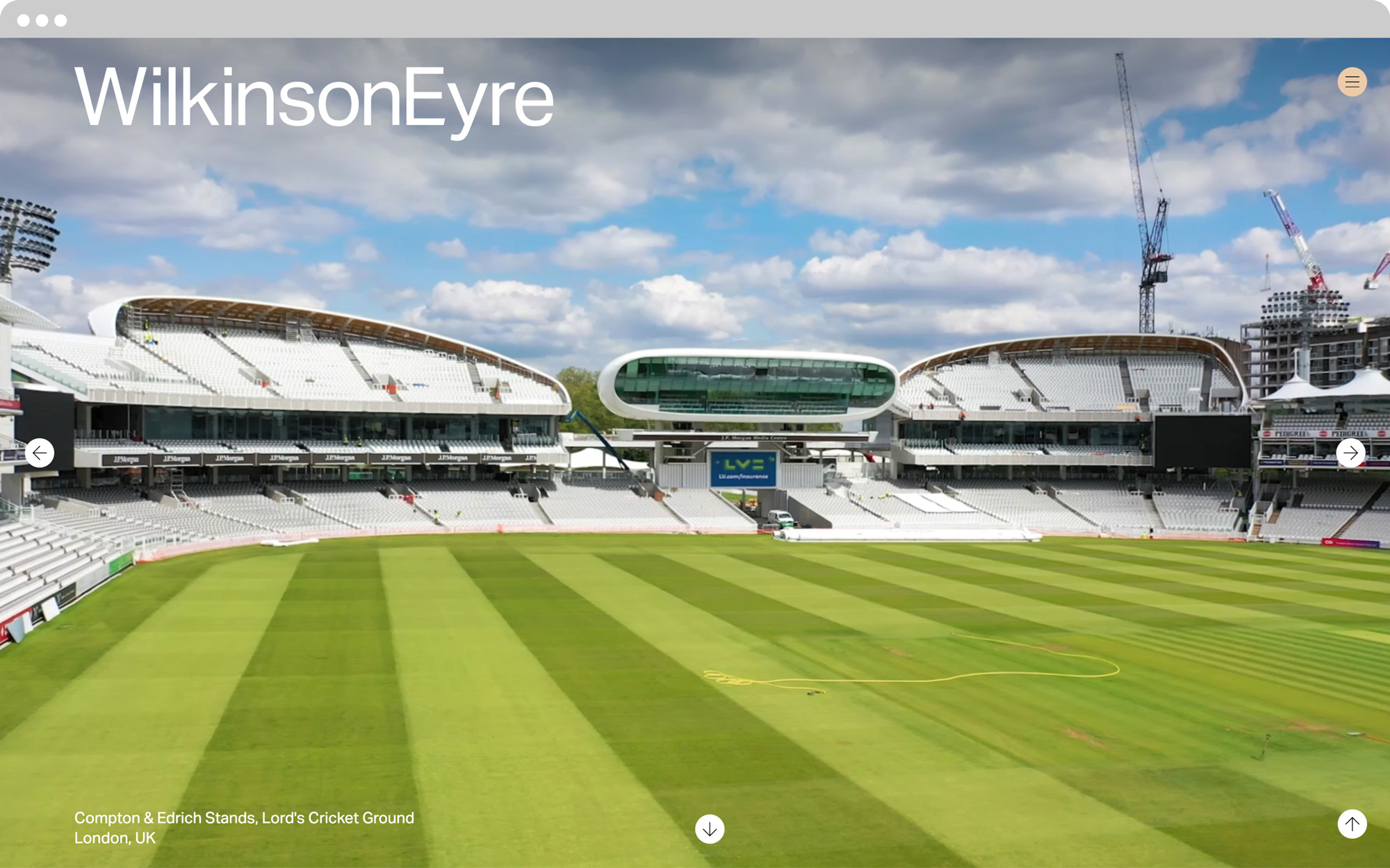
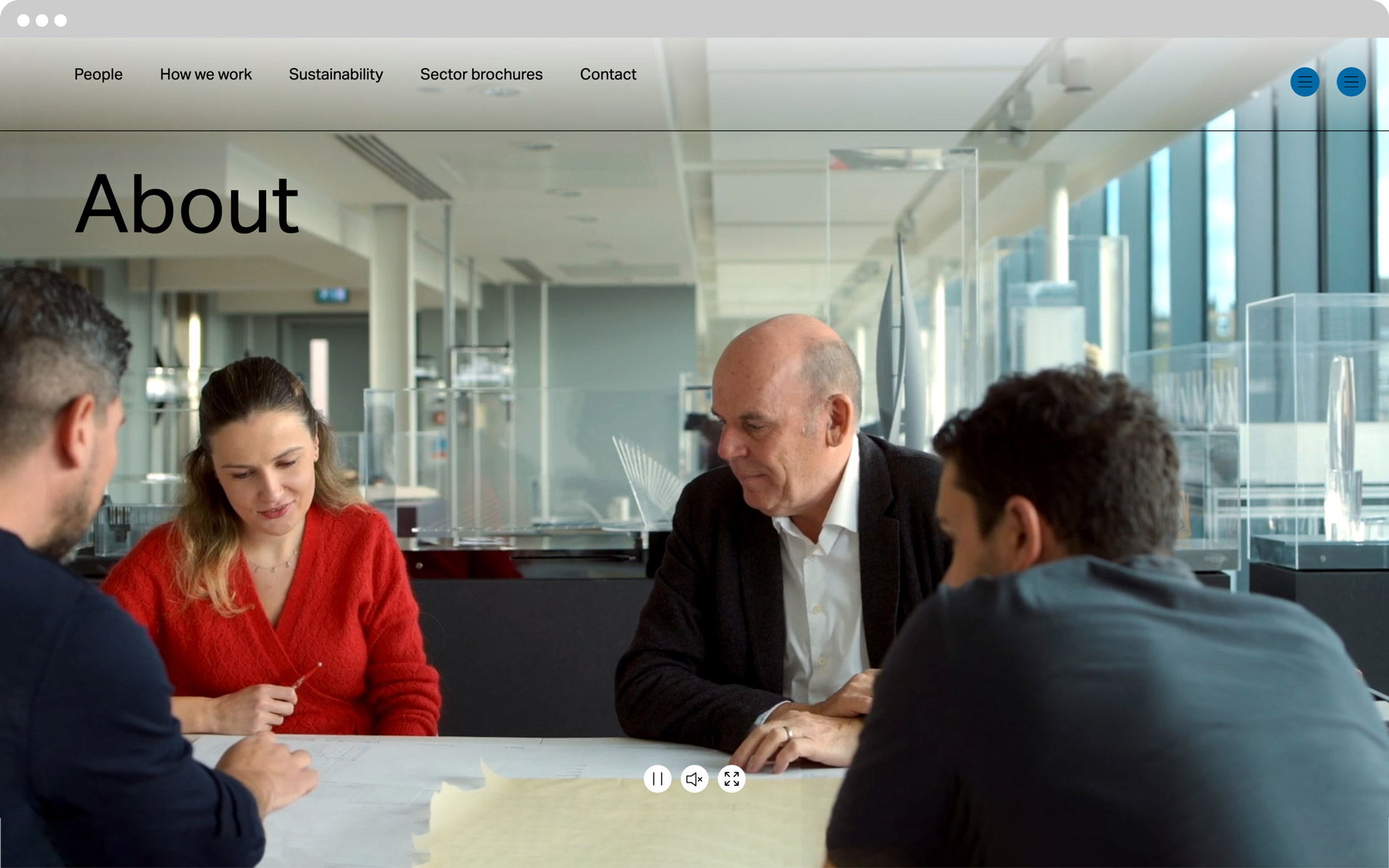
Video plays a key role in the design of the site, immediatedly engaging and offering a more complete overview of the project work.
The WilkinsonEyre identity, a setting of the Aktiv Grotesk typeface, embodies the practice ethos.
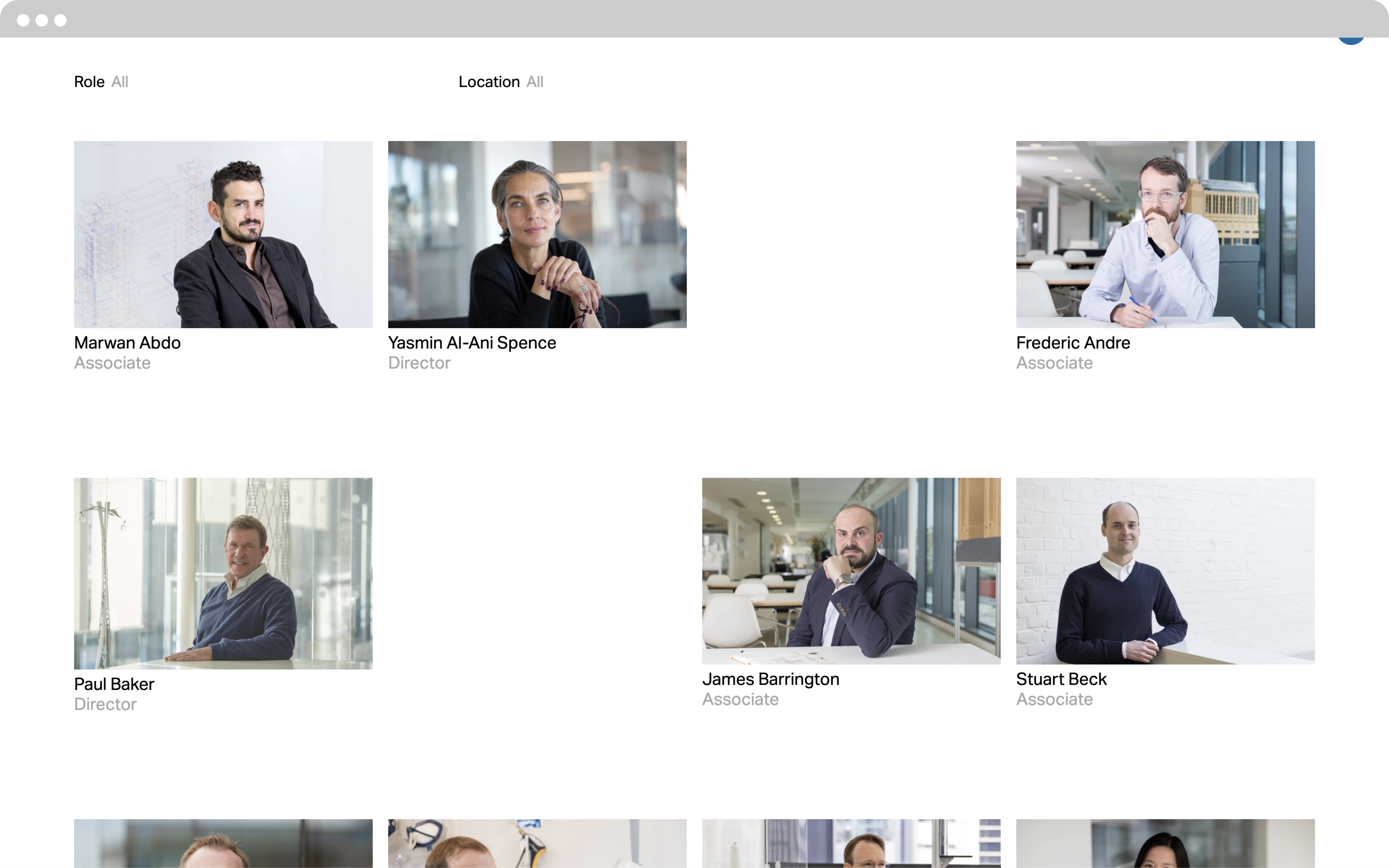
Custom templates were designed for all devices.
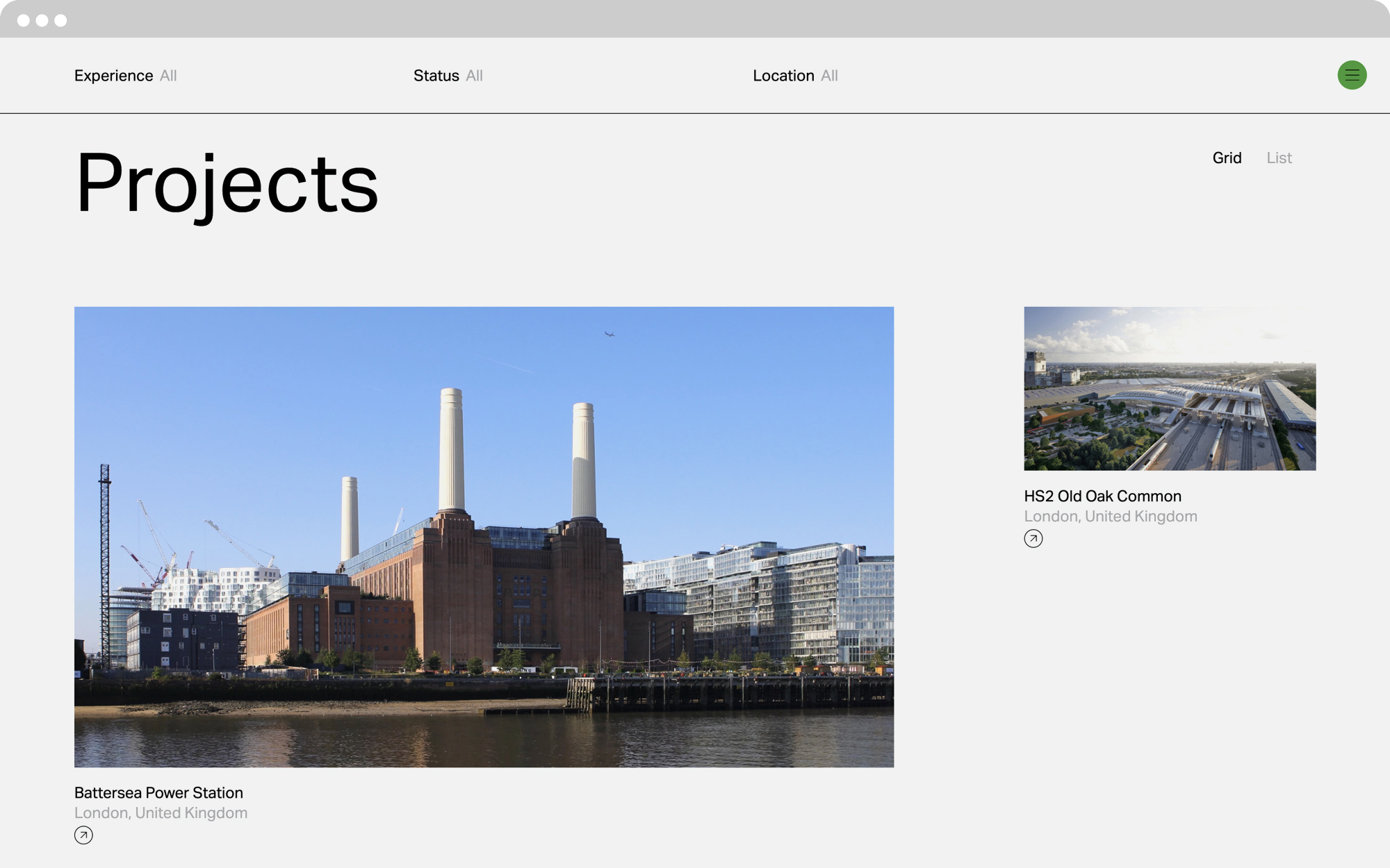
A selection of vibrant colours, inspired by the practice’s portfolio add impact and emphasis to the content.
A custom icon set aid user navigation throughout the site.
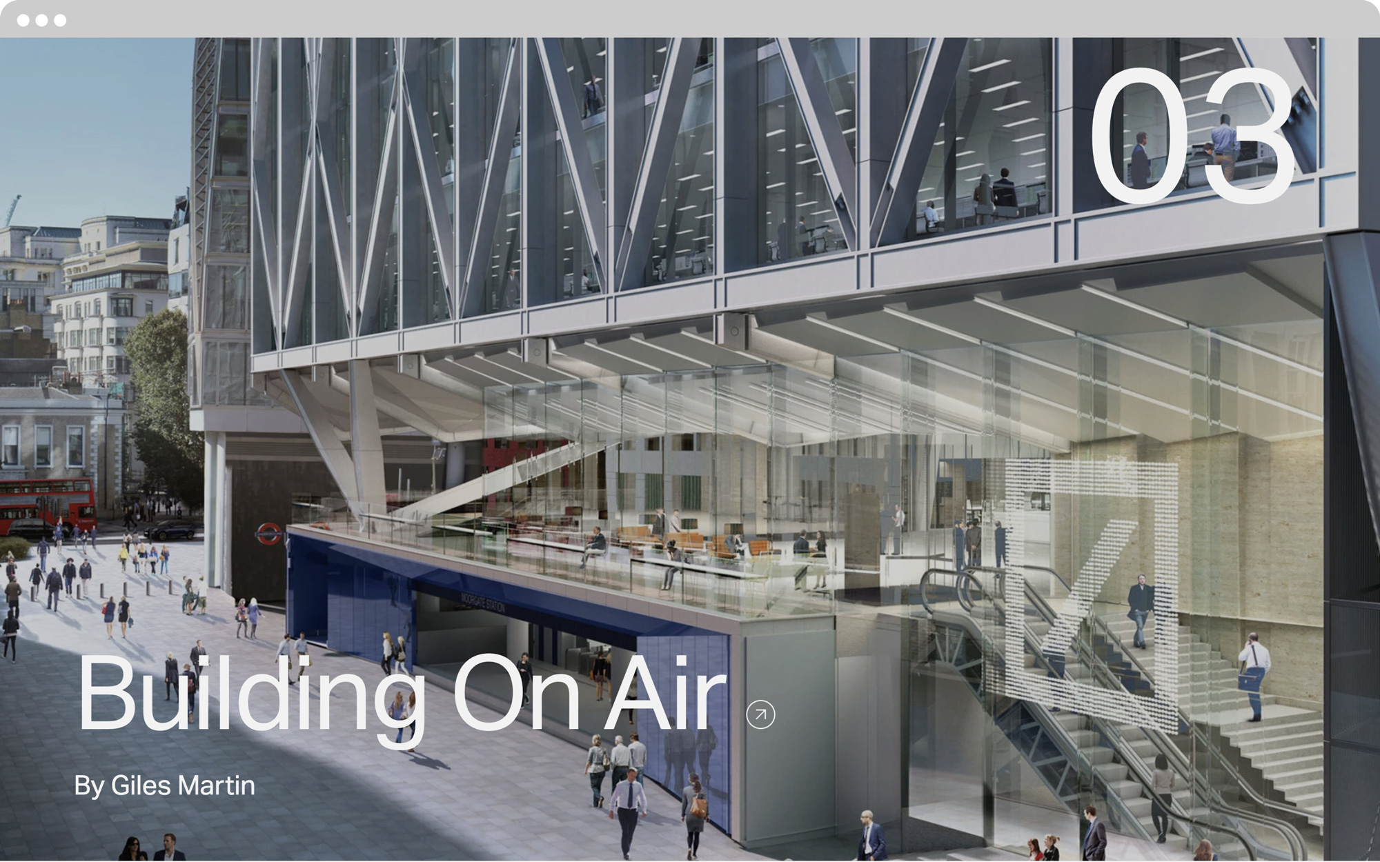
The Thinking section focuses on article themes, drawing disparate archive projects together, that would otherwise be undiscovered.