Solus
Rebrand for architectural ceramics company with a confident, minimal identity that puts the emphasis on sustainability.
Sectors
Disciplines
Year
- 2023
Solus is a family owned and operated company since 1995, suppling architectural ceramics globally from their base in Birmingham. In 2023 the business sought to rebrand in order to communicate better with, and support, the Architecture and Design community.
Solus’ success in their market had been previously due to individual efforts of the management and sales teams. The brand itself had been undervalued and, as such, had low market recognition. The visual assets also did not inherently appeal to their key audience — namely architects and designers. Sustainability has also become a key driver for the business and the company have taken steps over the last few years to become a leader in this field.
Working in tandem with the reimagining of their London showroom, we developed a brand identity that set out to deliver a strong, design-focused point of view. The ambition for the brand was for clients to see Solus as more than a simple supplier; as a creative partner and a source of inspiration.
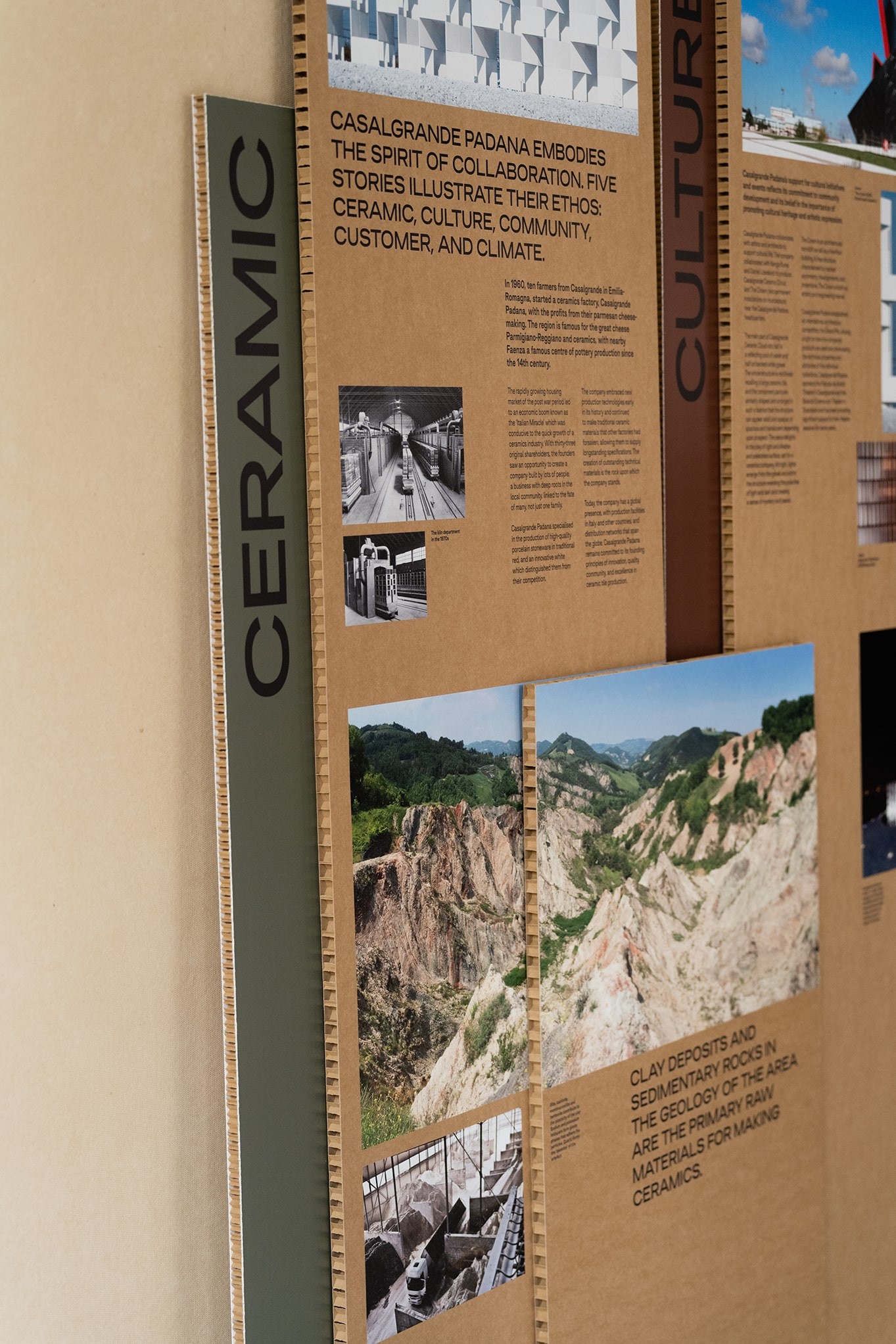
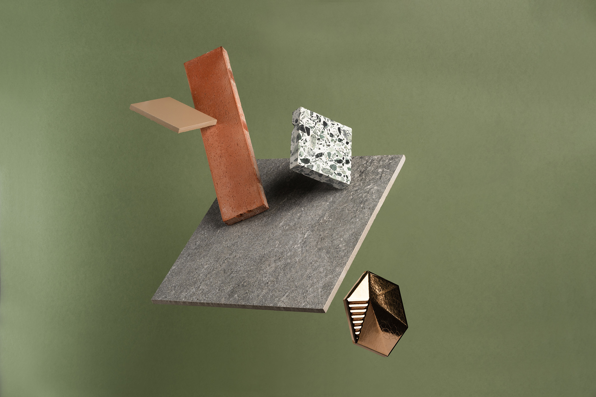
The brand strategy was built around the positioning statement ‘Down to earth’. The statement we created encapsulates the many sides of Solus. It describes the people; open, friendly and inviting, but also refers to the lifeblood of the business – earth. The beginning of the journey for every tile is earth, this not only puts a stake in the ground from a sustainability point of view, but also acts as a literal reminder that ceramics are a natural choice.
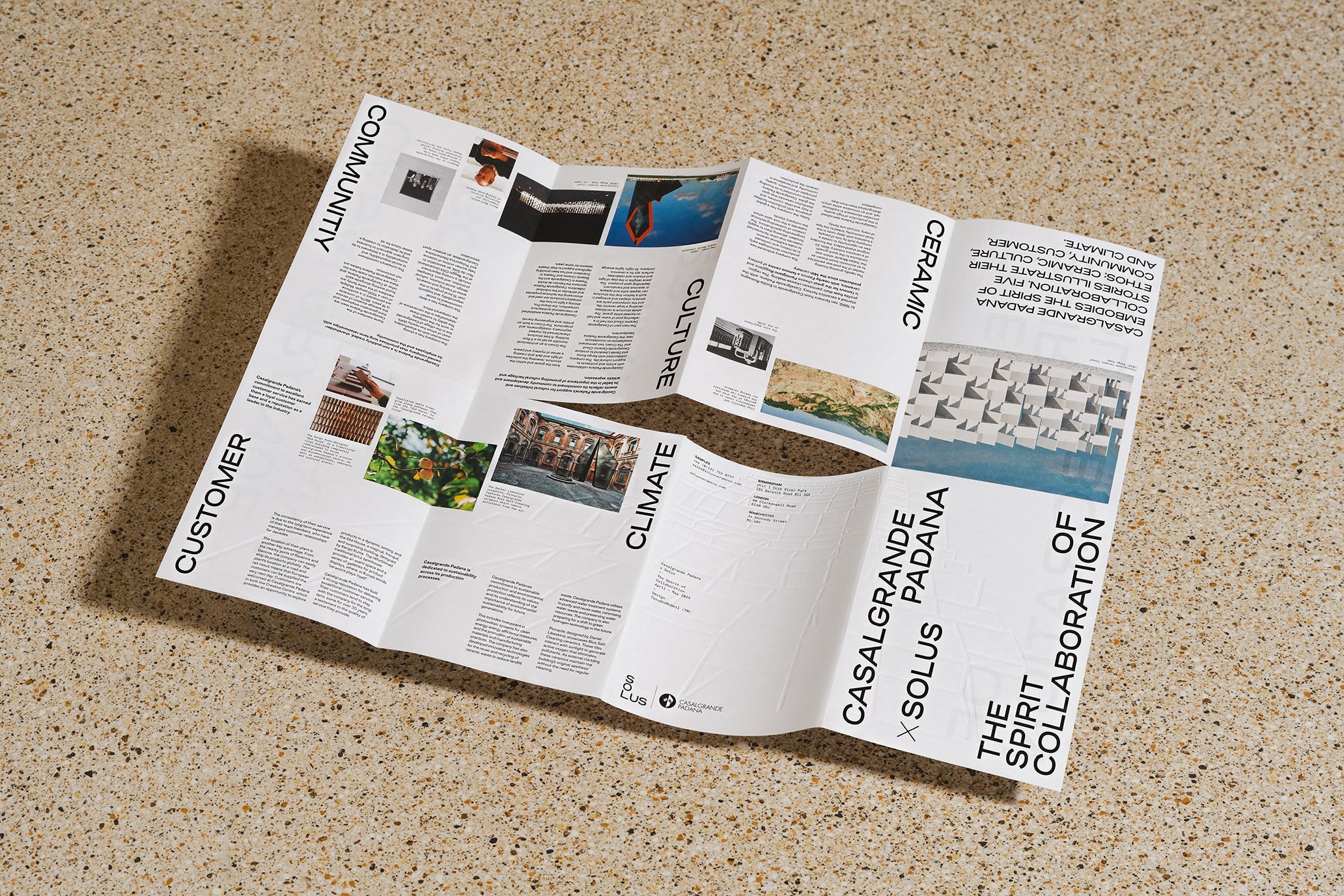
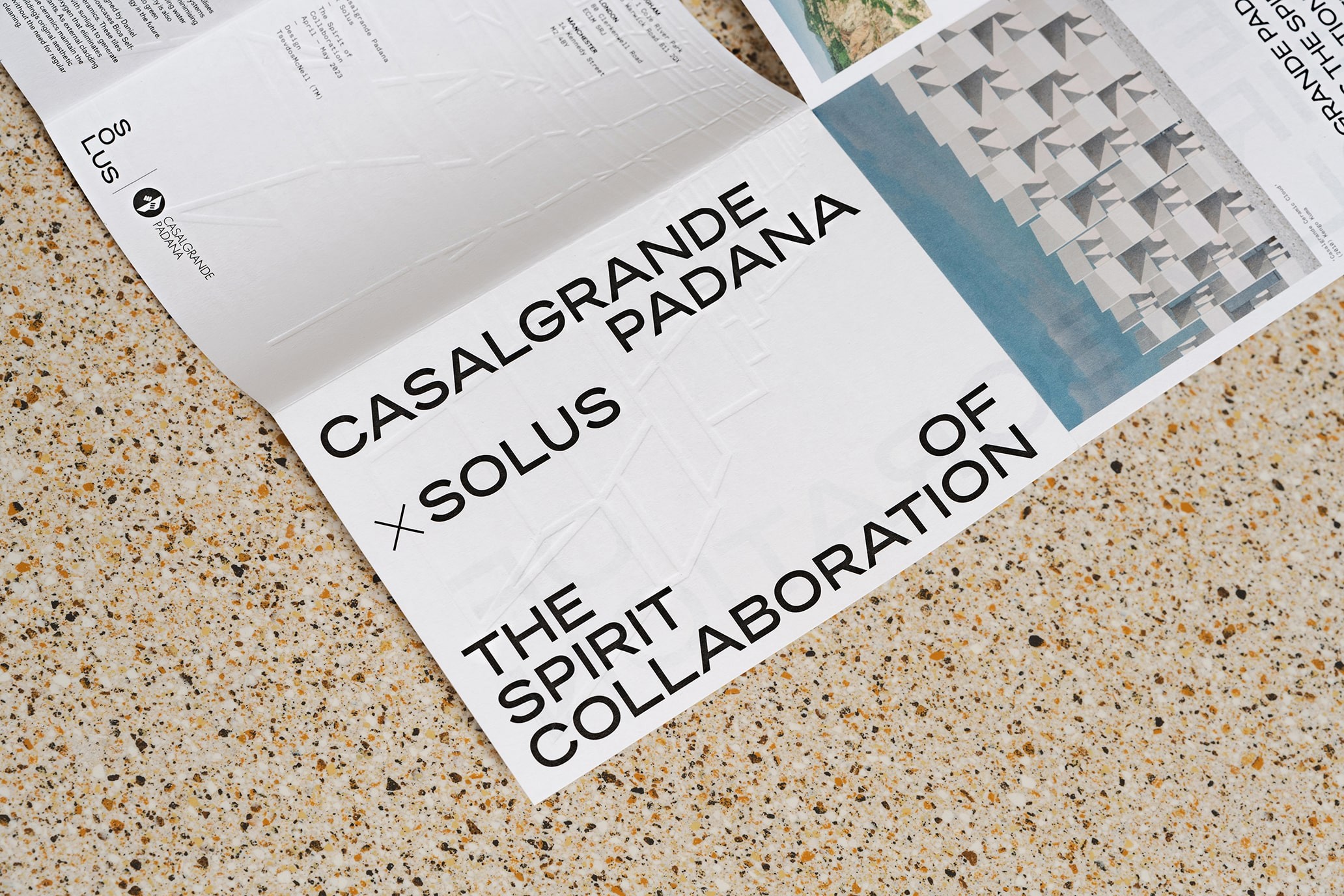
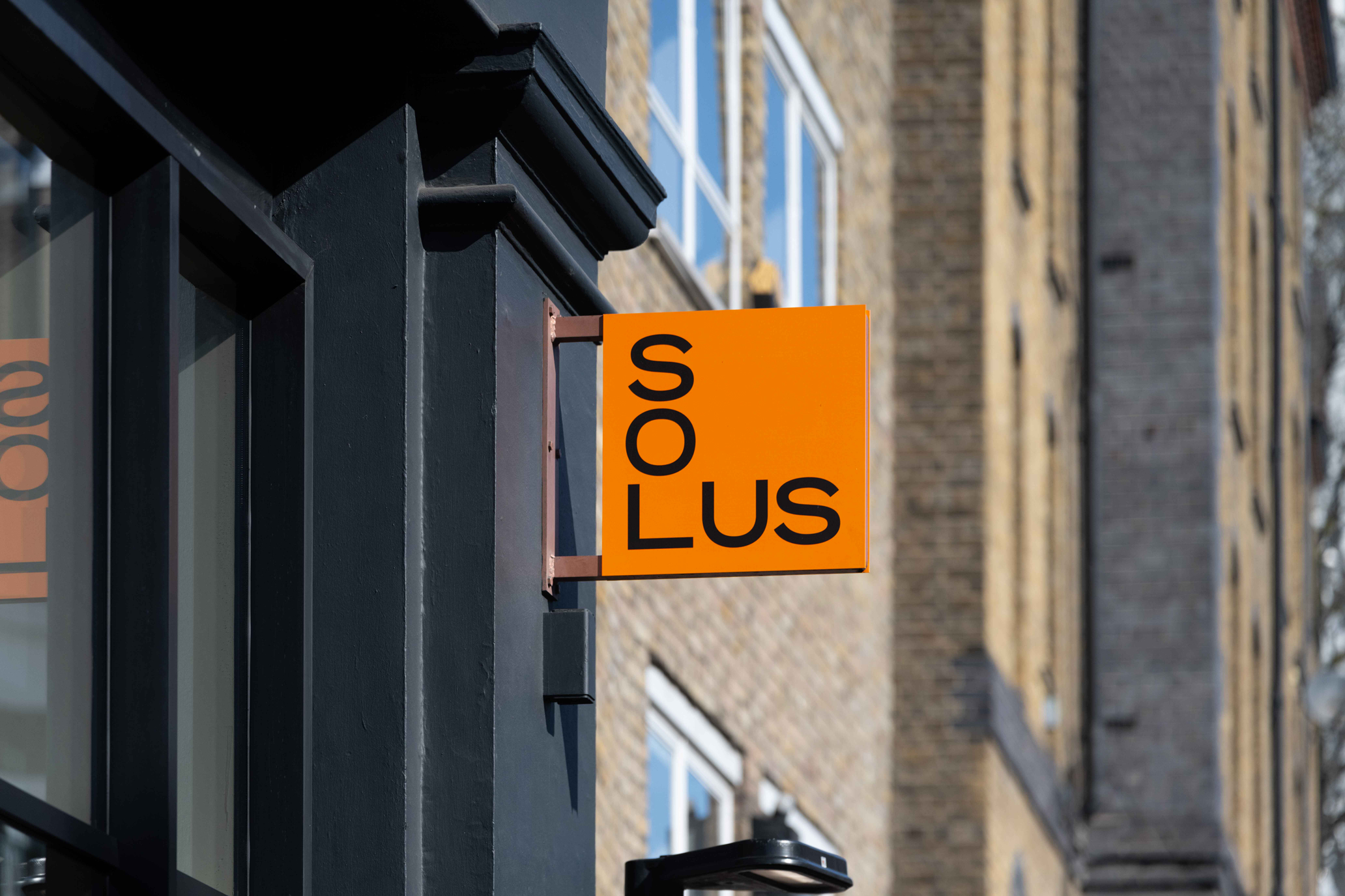
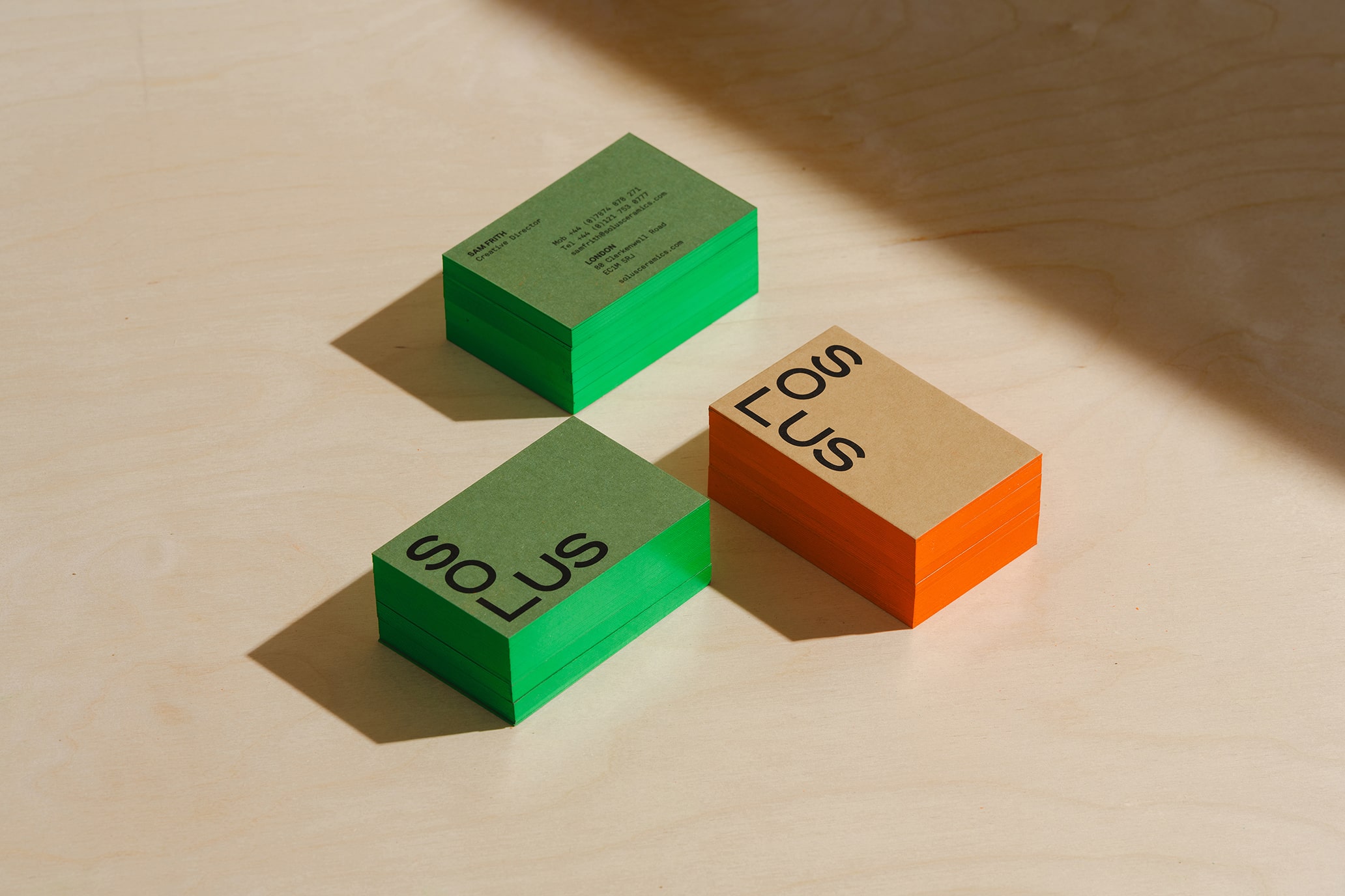
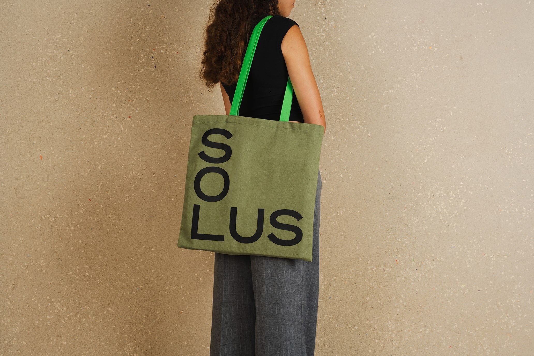
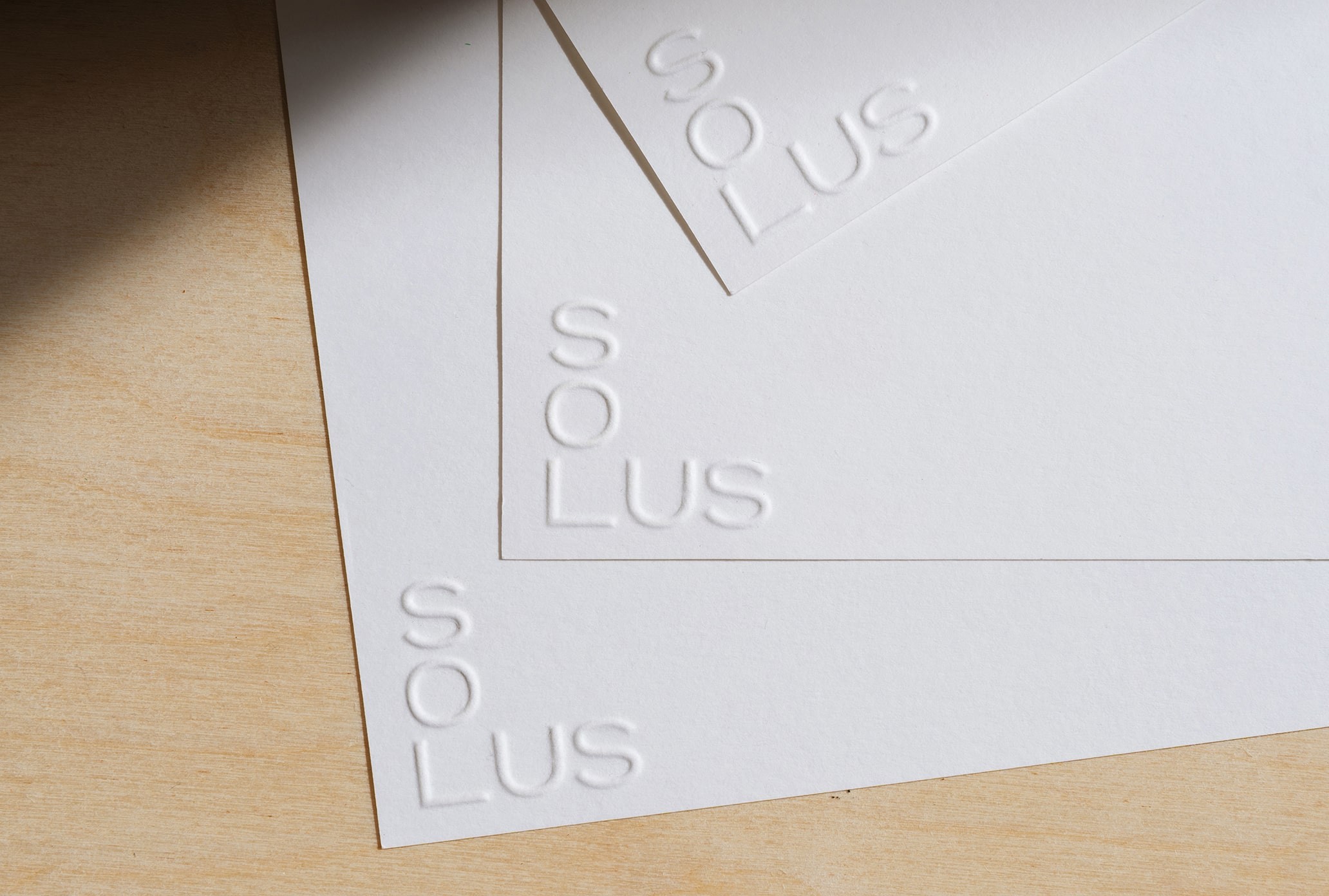
The logo is disarmingly simple, with an extended sans serif typeface neatly aligned in the formation of a corner, a nod to the rectangular structure of tiles. It comes into its own across a comprehensive set of touchpoints, each produced with sustainability at their core, using a minimum of processes and the least impactful materials wherever possible.
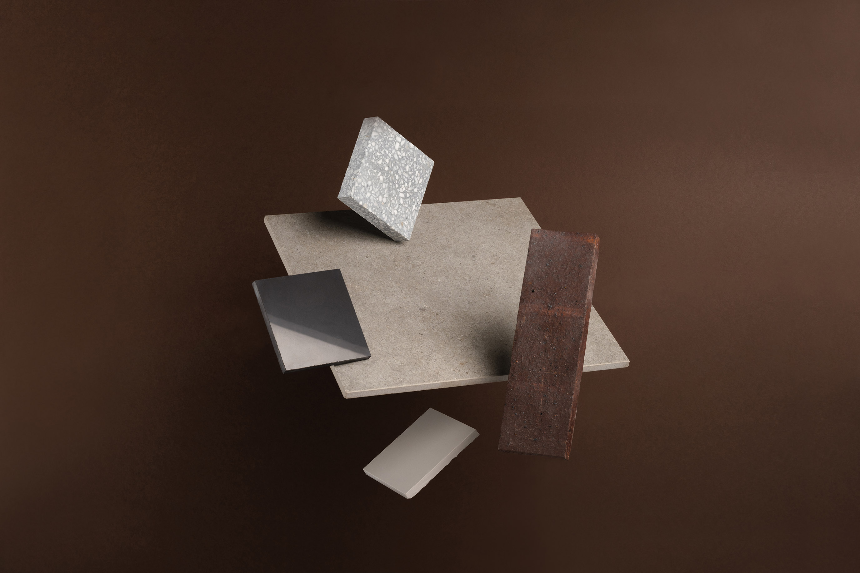
Art direction that takes ownership of Solus’ products. Photography Tian Khee Siong.
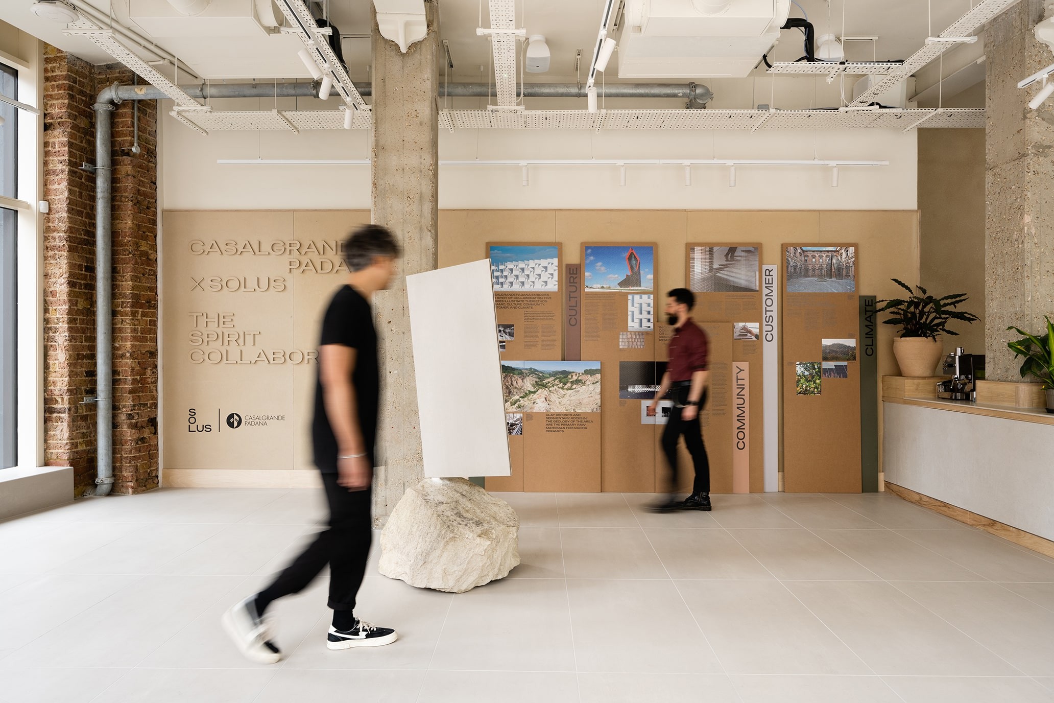
The rebrand ran in tandem with the reimagining of Solus’ London Showroom.
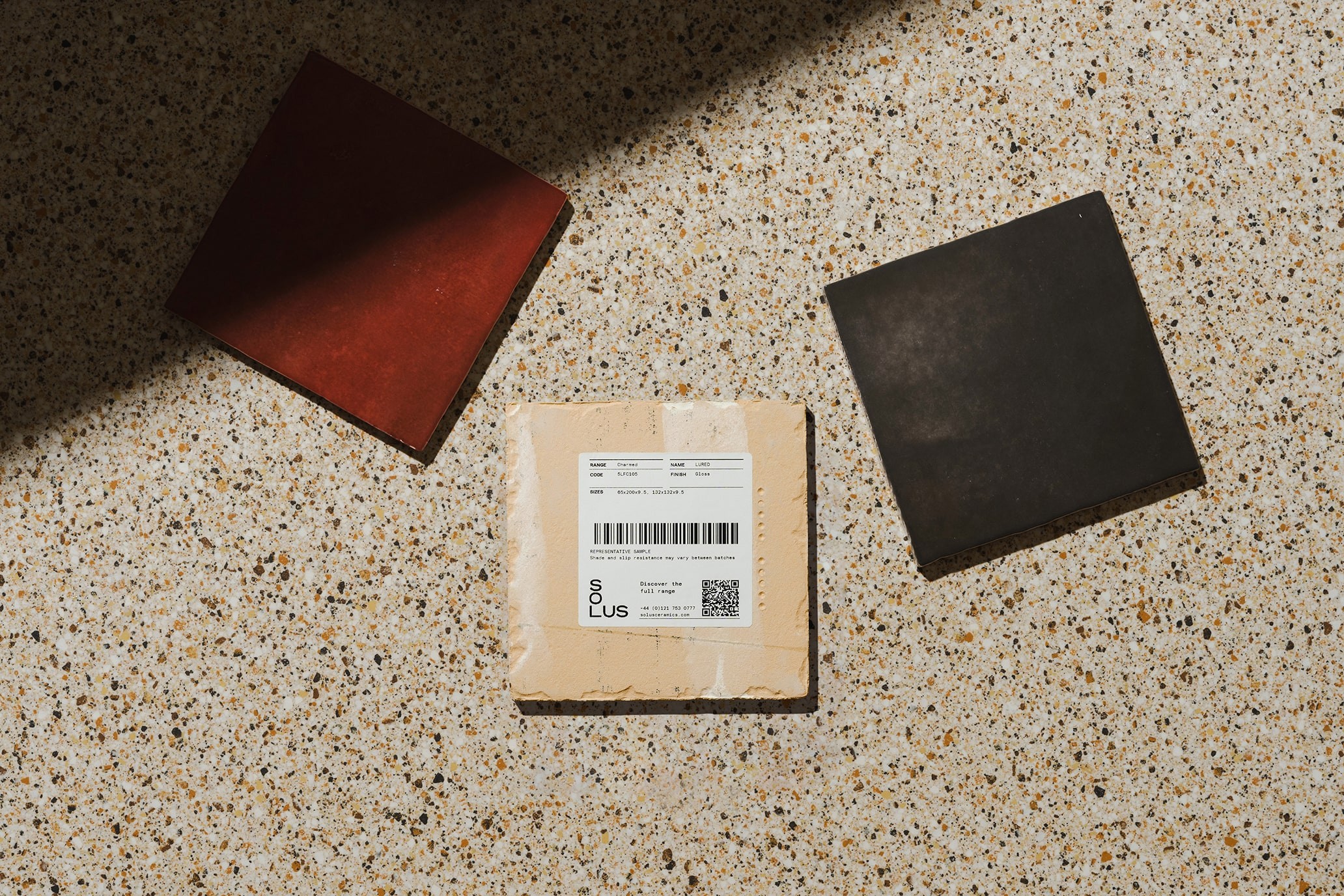
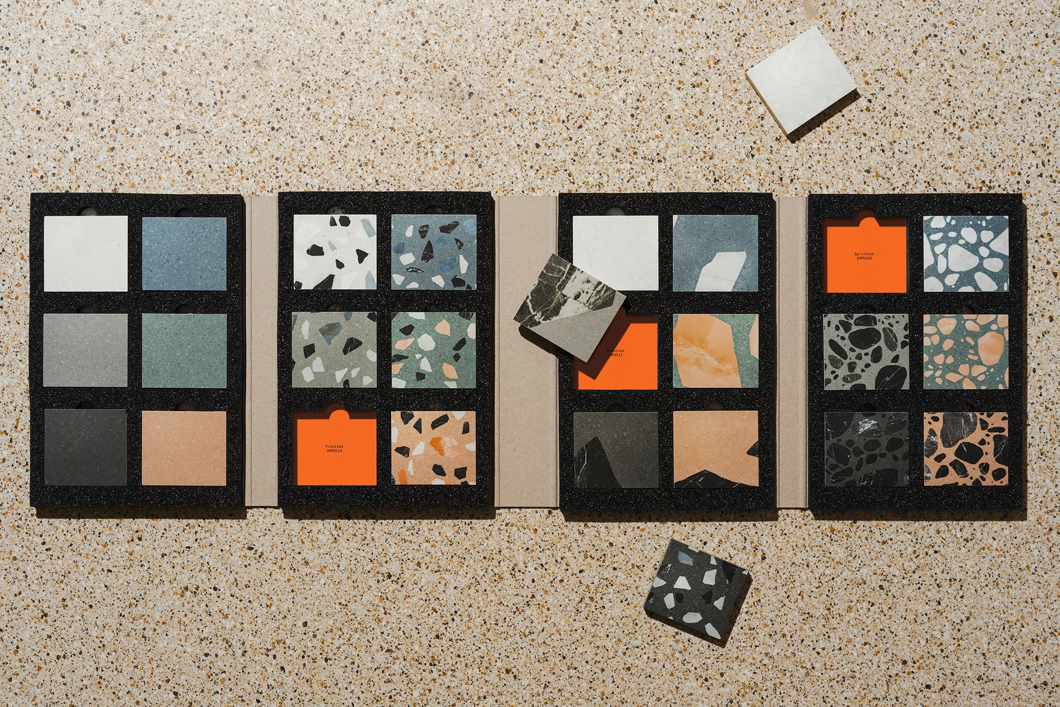
Singular art direction that takes ownership of Solus’ products. Photography Tian Khee Siong.
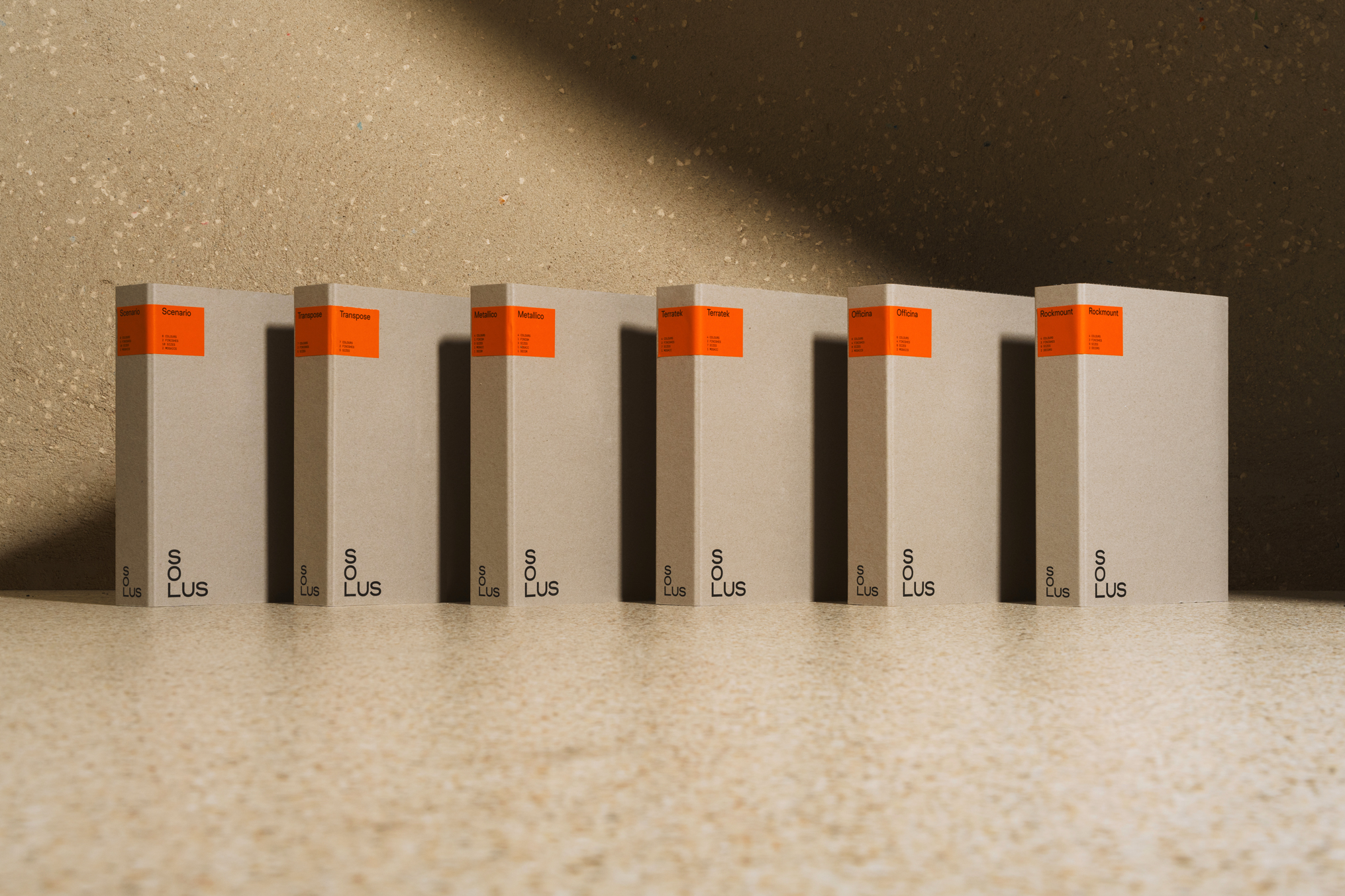
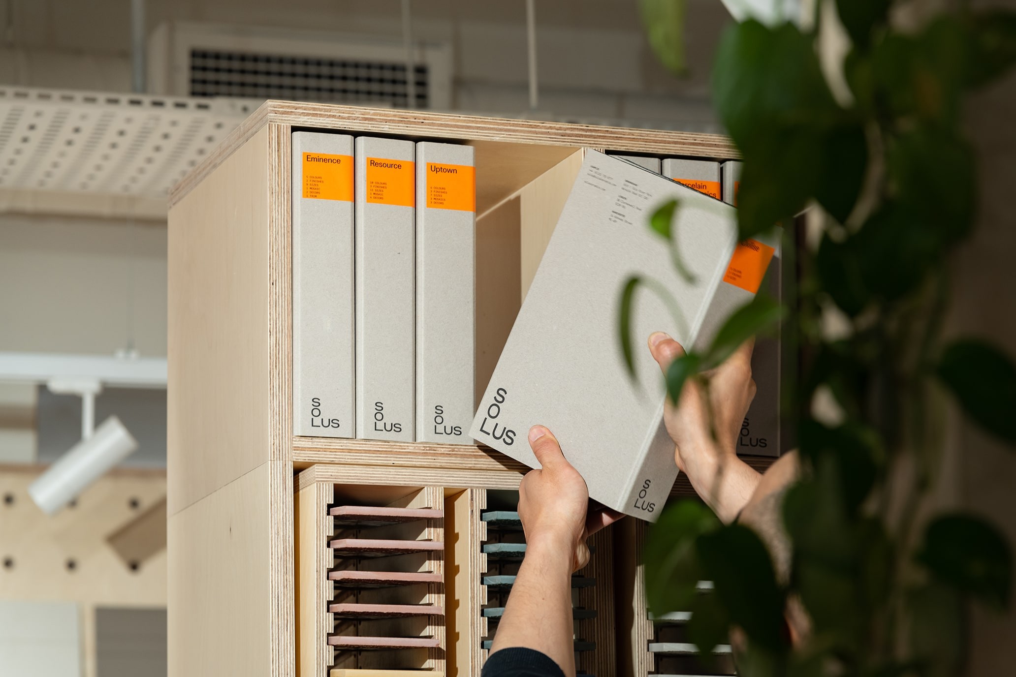
Product wallets on dutch greyboard with a single colour print, making the production as low impact as possible.
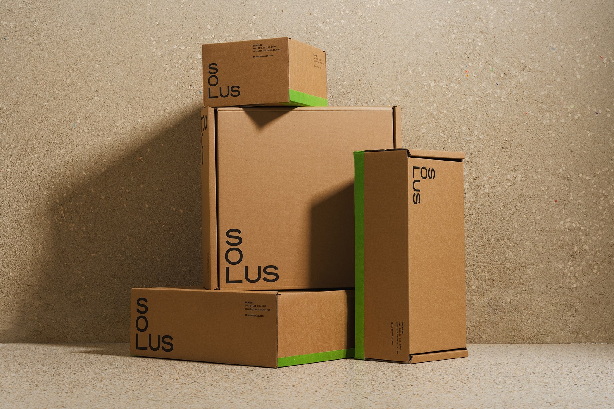
Low impact environmental packaging, making use of custom printed tape to add a colour emphasis.
The logotype informs the entire identity system across every touch point in both print and digital.
The logotype informs the entire identity system across every touchpoint in both print and digital.
Singular art direction that takes ownership of the Solus’ products. Photography Tian Khee Siong.