Mylands
Imbuing a British company with the honesty of its historical past.
Sectors
Disciplines
Year
- 2022
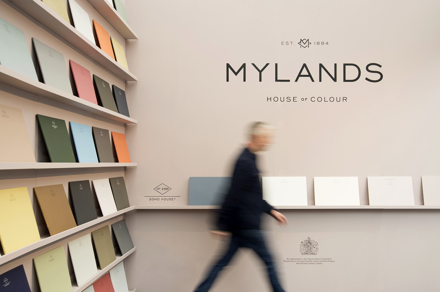
Mylands are a luxury paint manufacturer founded in 1884 in London. As a family business, now in its fifth generation, it has an incredible history providing paints for film, television and even the army during the World Wars. The old brand identity didn't echo the inherent quality in Mylands paints, which contains super fine ground marble powder to make it one of the most matte pigments on the market. This, accompanied by the sumptuous range of colours, led us to the positioning line 'House of Colour', to cement its position within the sector as the arbiter of colour. From a brand identity perspective, we studied the history of the company, including early iterations of Mylands' shop signage from the 19th century to help inform our direction with the brand.
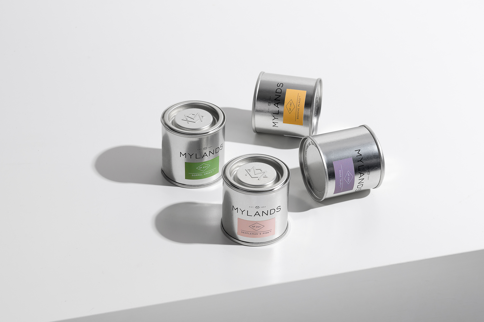
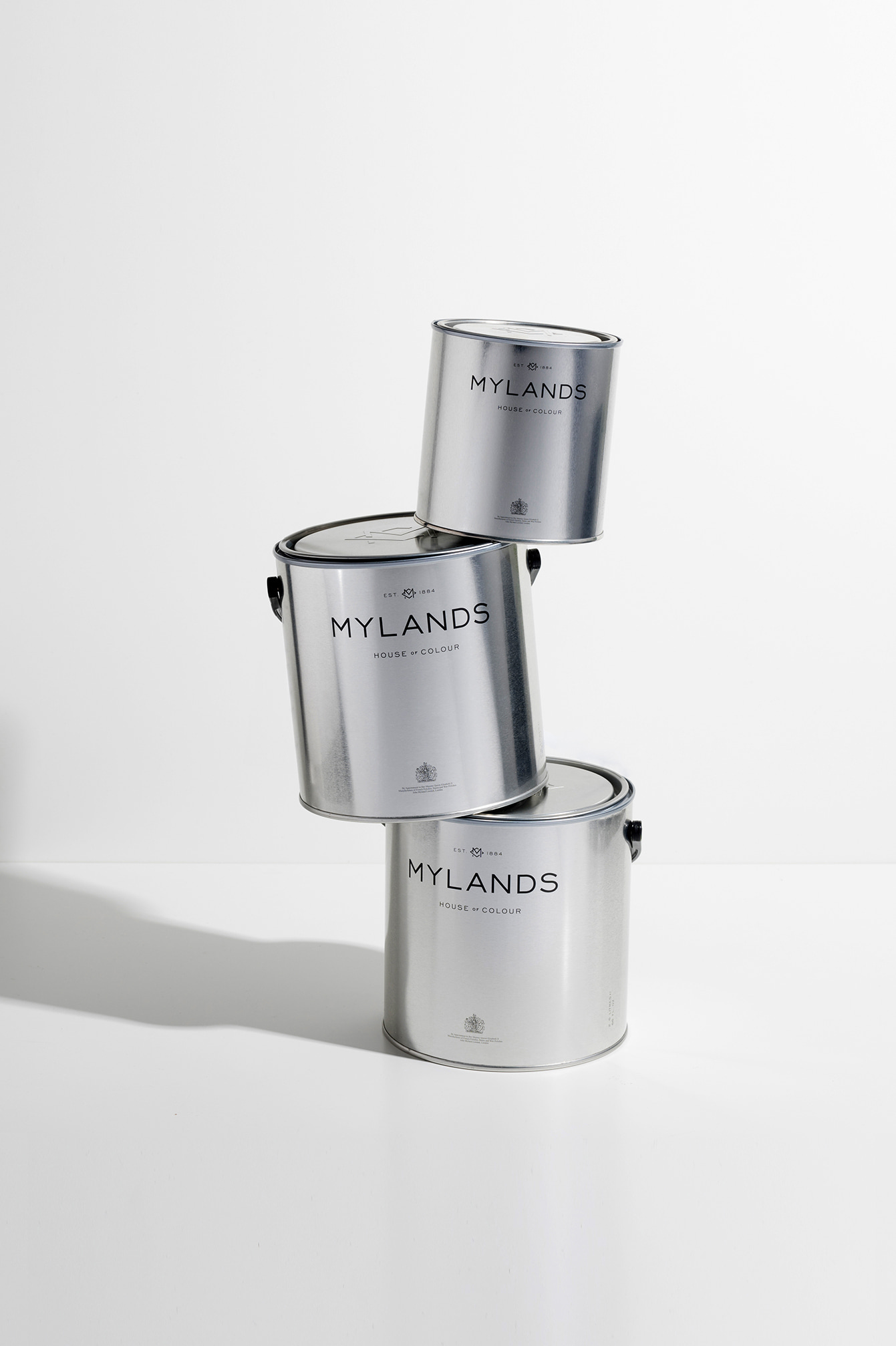
We also took inspiration from other archetype British typefaces form the early 20th century to develop a logotype that felt more in keeping with the company's story. We also unearthed and updated a symbol which is proudly emblazoned across the marketing collateral. On the rest of the suite of material, we were keen to differentiate from its competitors by introducing a raw metal tin which shines from the shelf, along with a more bold set of colours to use on chip charts and specifying tools. This project was carried out in collaboration with Sarah Miller & Partners.
The positioning line 'House of Colour' gave the stepping-off point for all brand communications.
The positioning line 'house of colour' gave the stepping off point for all brand communications.
The industrial heritage of the brand was reinforced through the use of honest untreated materials, exemplified in the design of the sample tins.
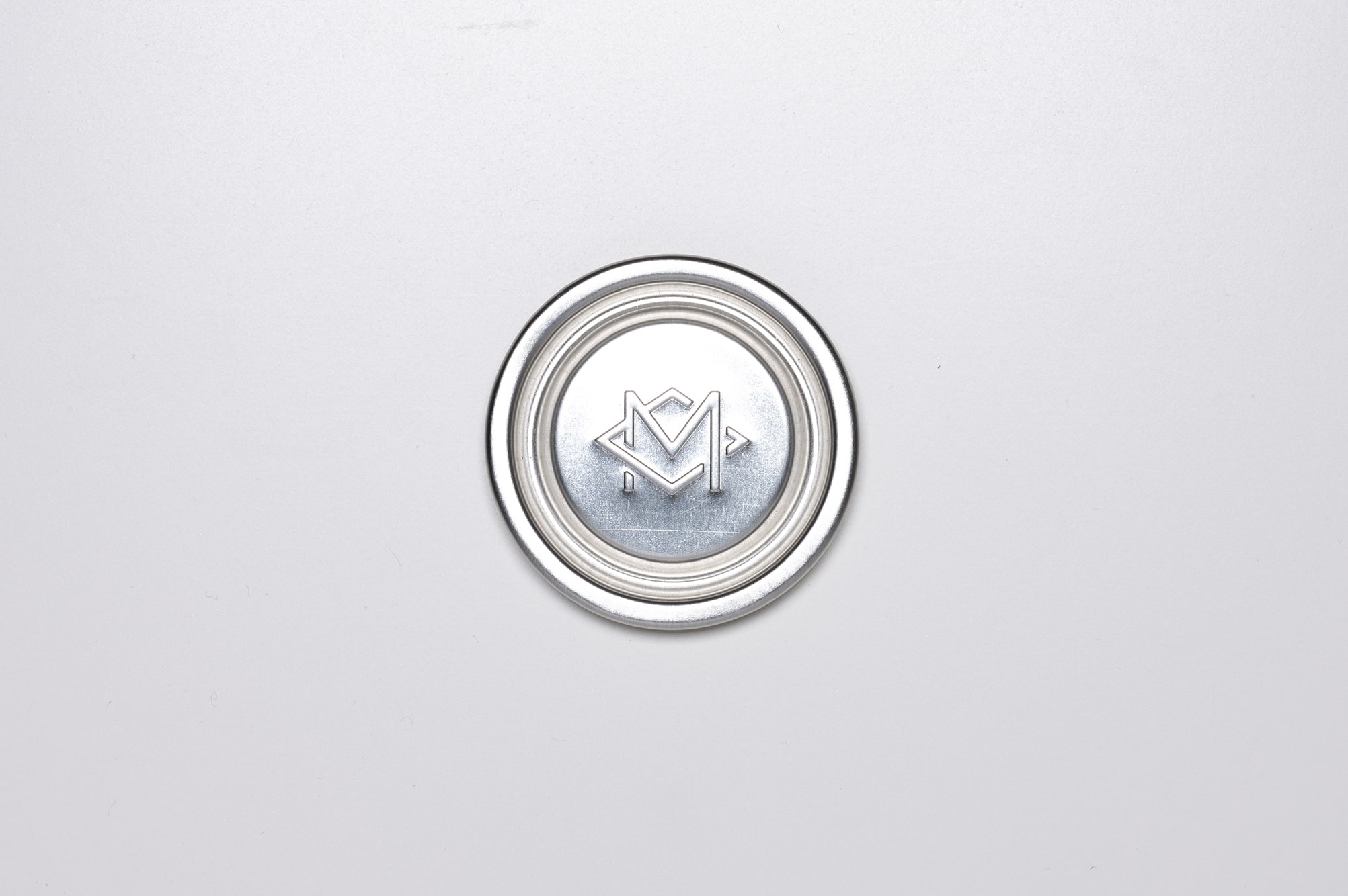
The typographic style and ‘M rhombus’ monogram was derived from references in archival material.
The typographic style and ‘M rhombus’ monogram was derived from references in archival material.
Art direction for the ‘Greys & Neutrals’ campaign. Photography by Jake Curtis.
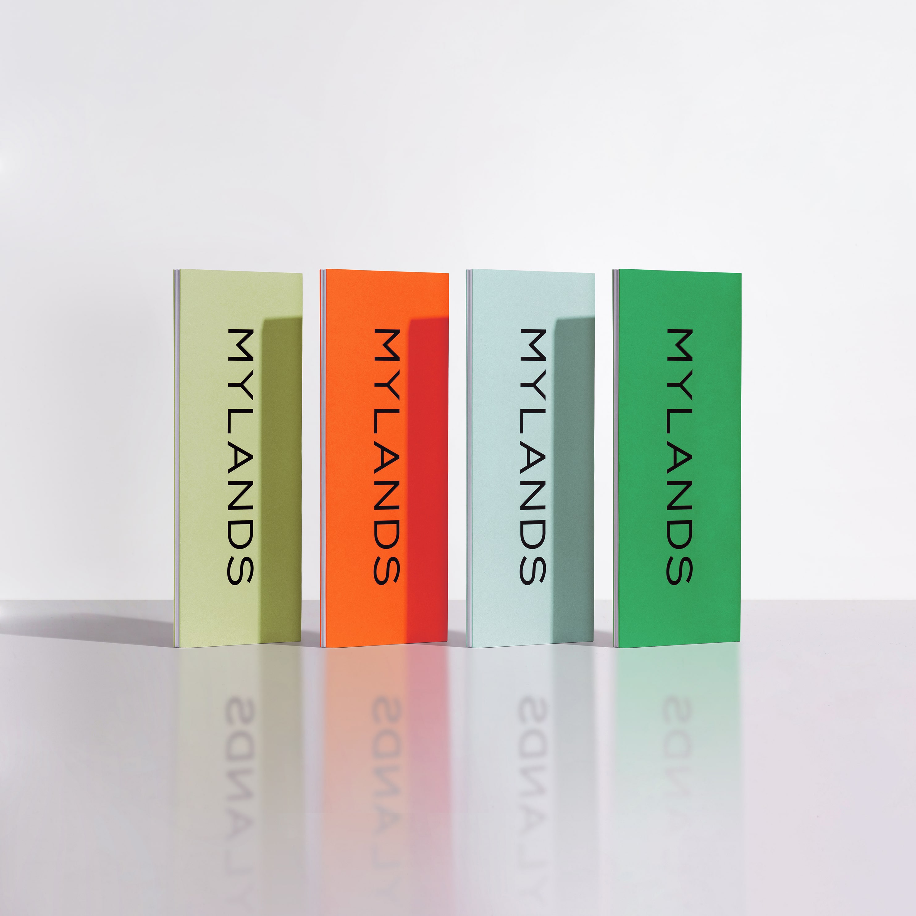
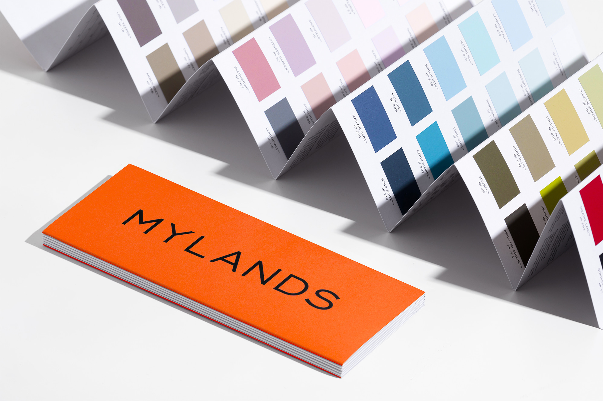
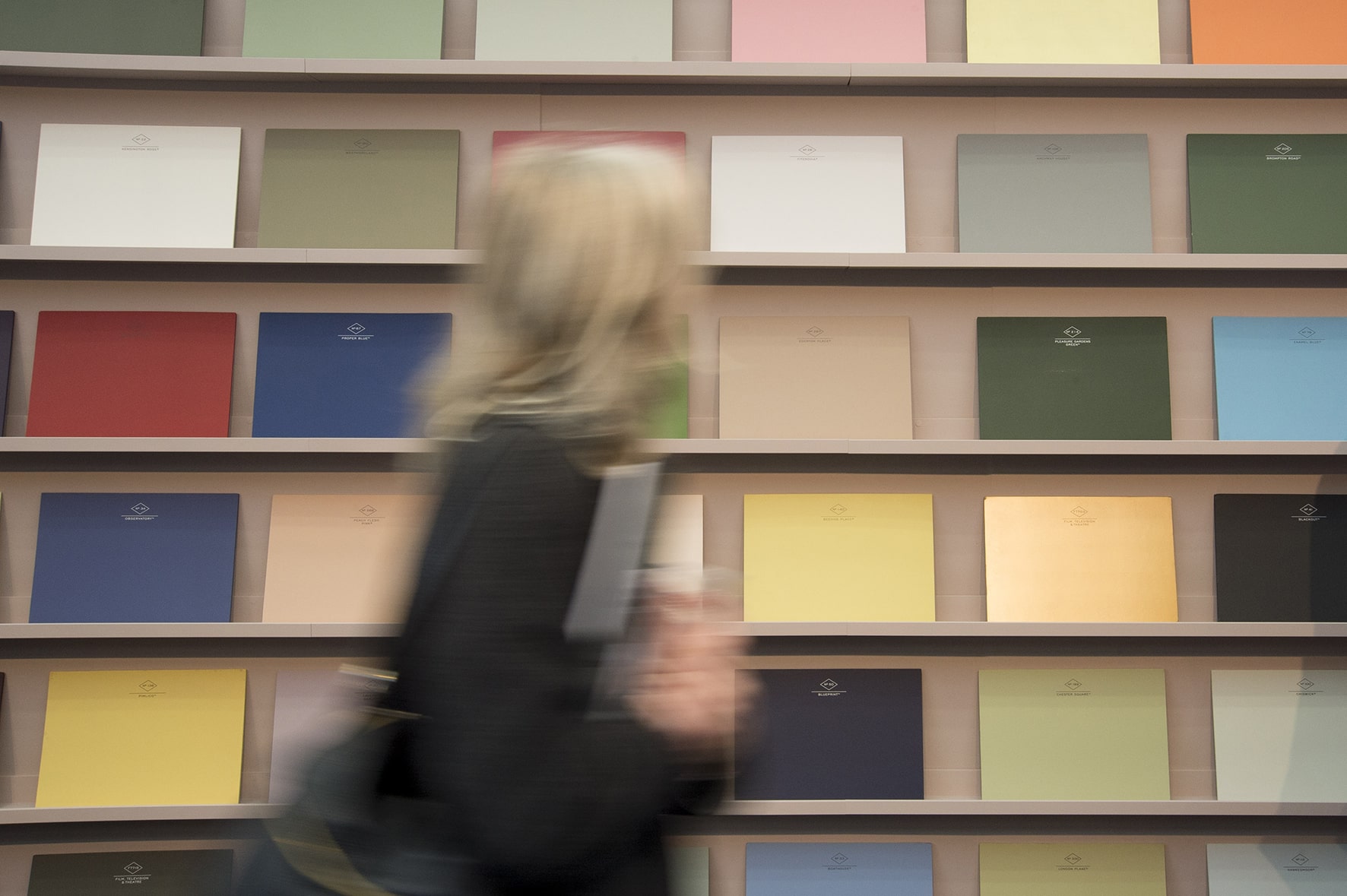
Colour cards designed to effortlessly embody the ‘house of colour’ positioning line.
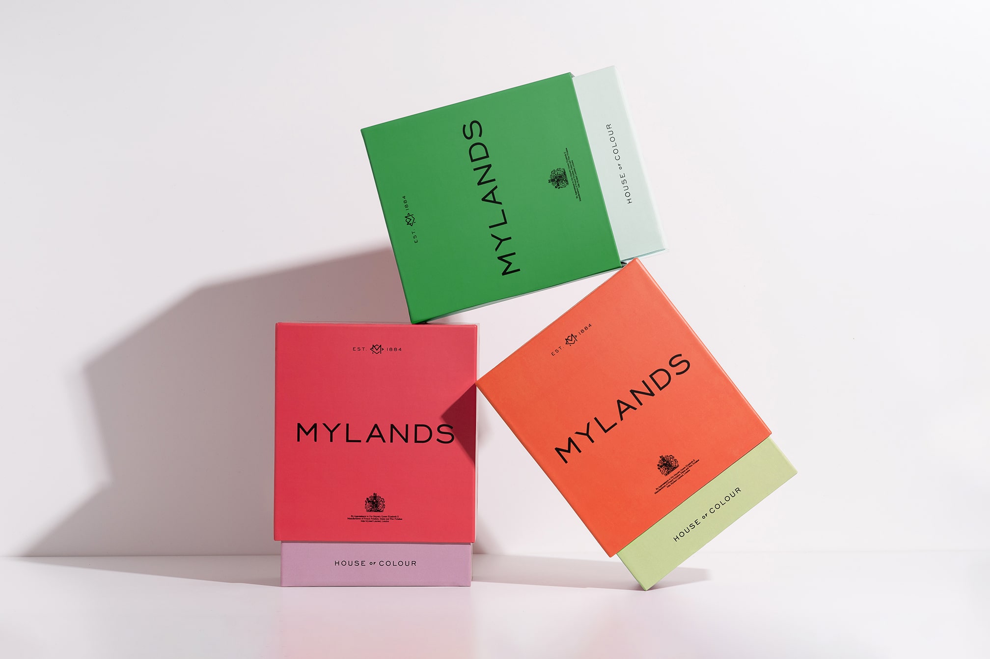
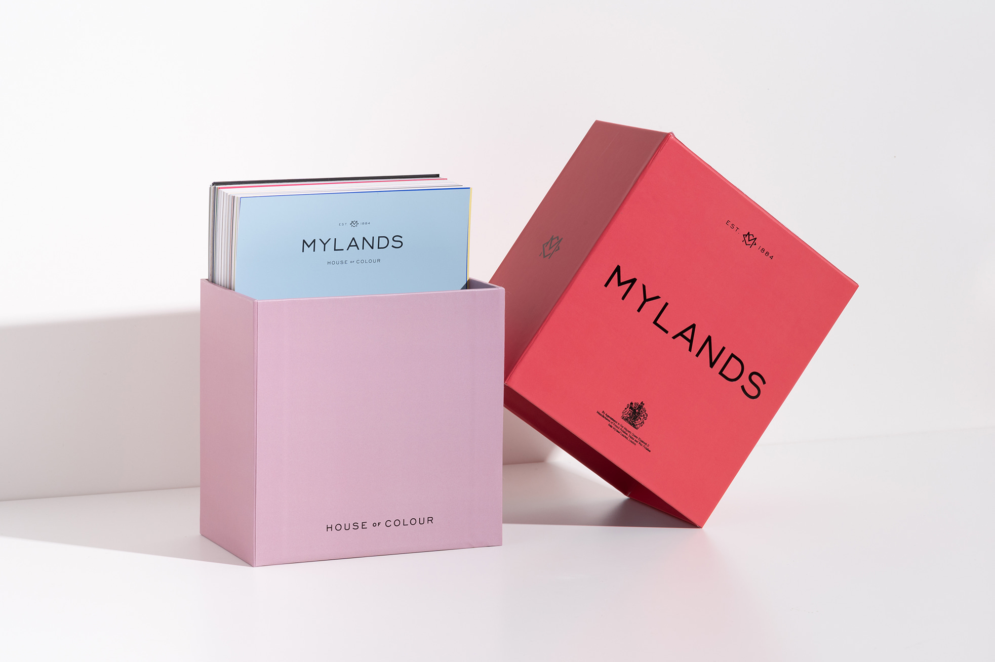
Large format 'architects box’ designed as an essential tool for all paint specifiers.
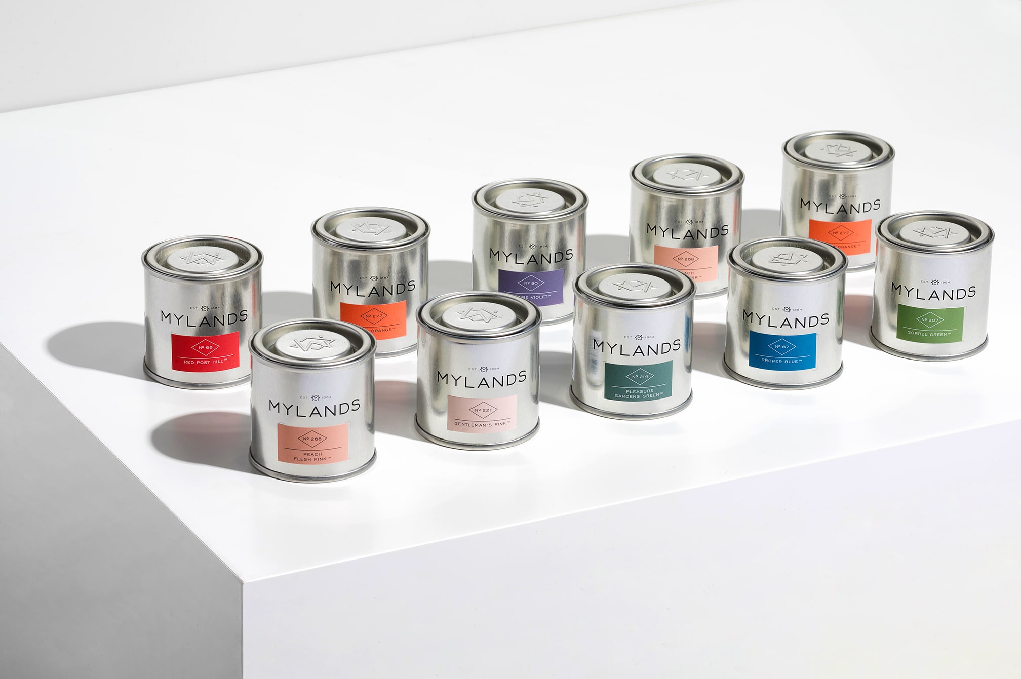
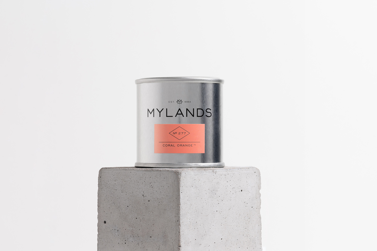
Naming and labelling system making use of the rhombus motif.
Naming and labelling system making use of the rhombus motif.
Exhibition stand design at Decorex.
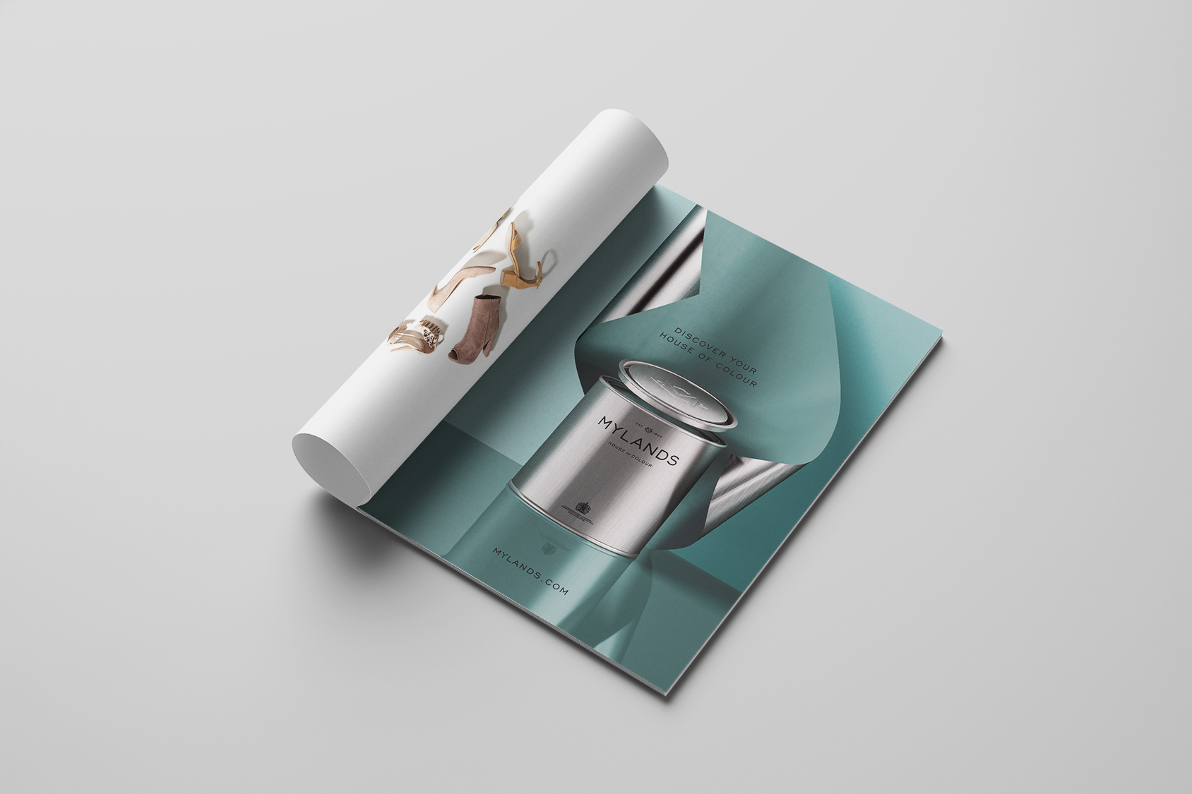
A surreal advertising campaign to showcase the new tins.