Michaelis Boyd
Reframing the brand to better reflect the emotive, meaningful and thoughtful work created by this outstanding architectural practice.
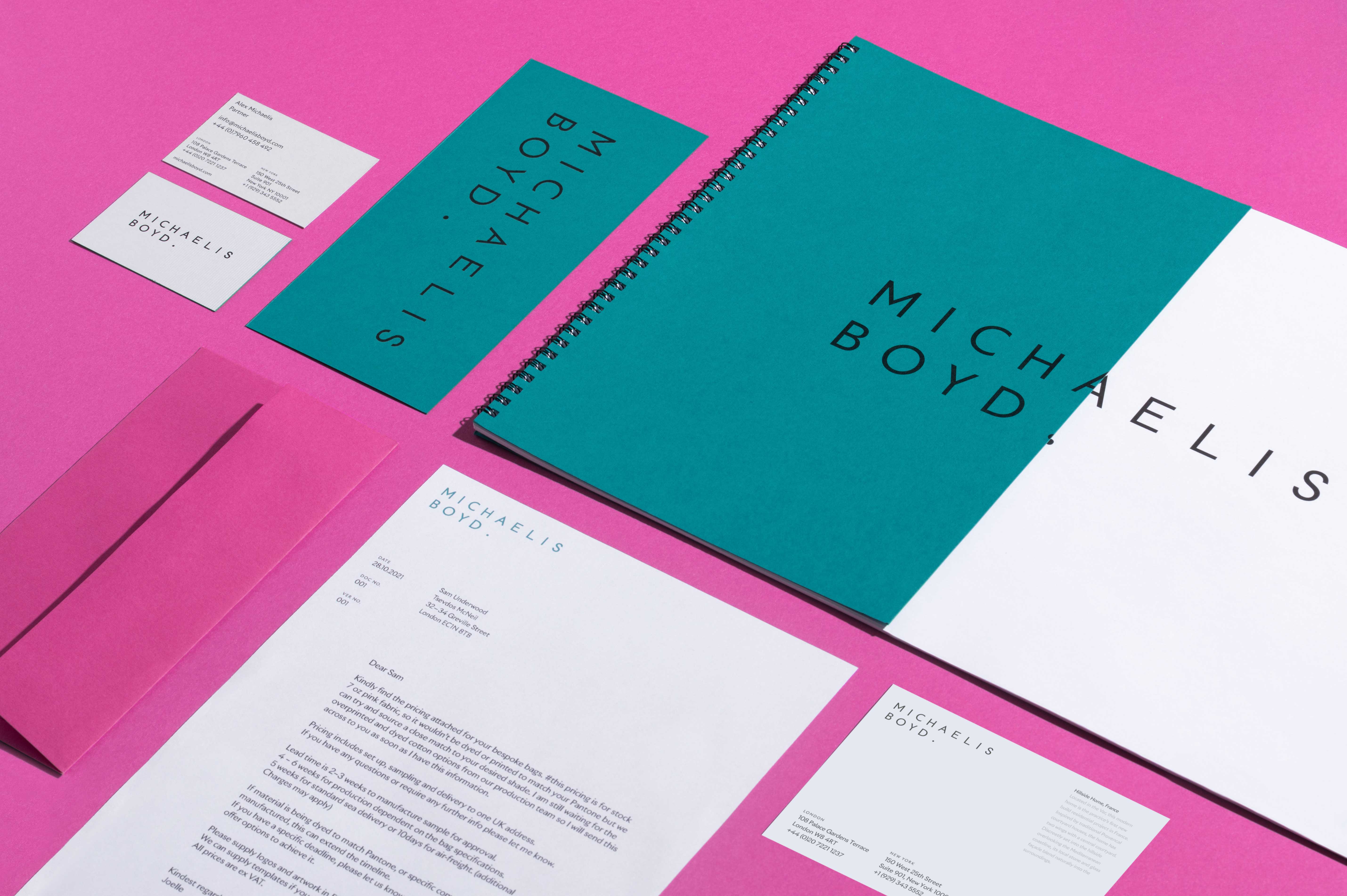
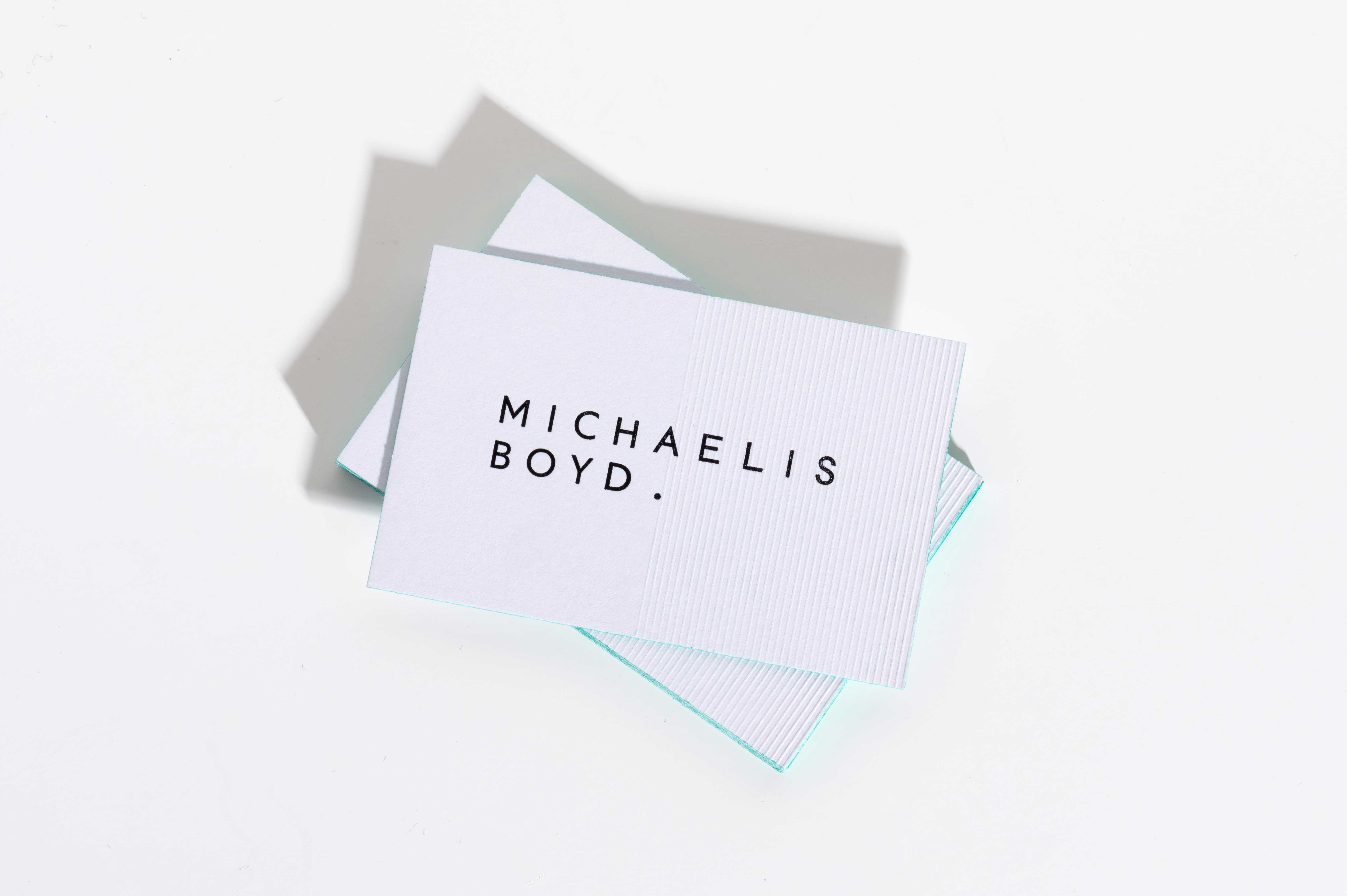
Michaelis Boyd are a highly-acclaimed architectural and interior design studio in London, with offices in New York. Their work is well-known, having set the signature style for Soho House, but their name as a practice had little recognition. The brief given to us was to overhaul their brand, from a strategic and visual perspective, with the aim to properly represent the work and invite even more impressive clients. As a first step, we delved into the training and aesthetic drivers of Founding Directors Alex Michaelis and Tim Boyd. Having worked for and studied underneath some of the forefathers of mid-century British architecture, our first port of call was to explore early-to-mid century sans serif typography – the likes of Johnston and Gill Sans. Inspired by these archetype British typefaces, we created an over-spaced logotype which embodies the humanist, modern nature of these typefaces and Michaelis Boyd's designs.
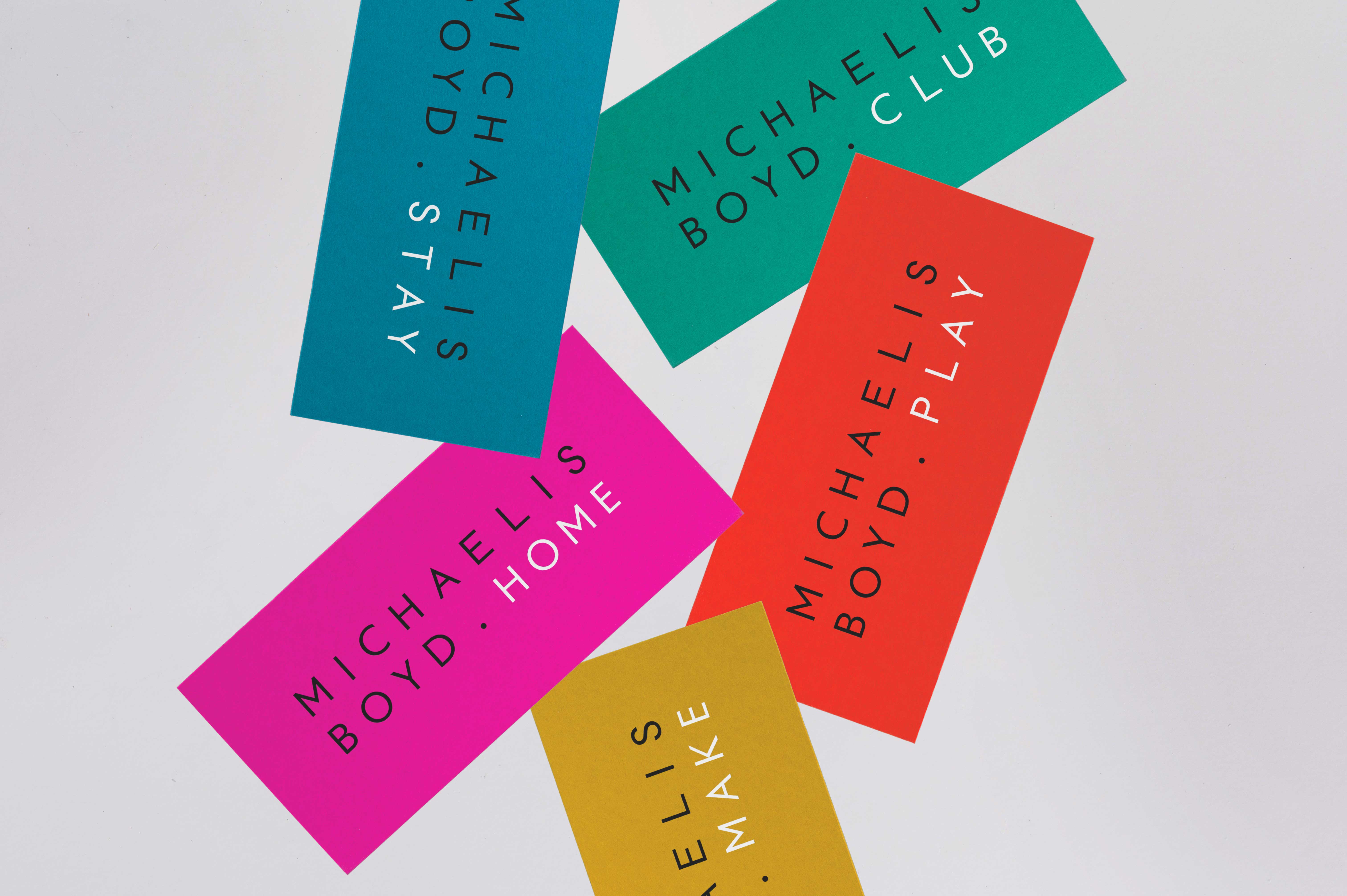
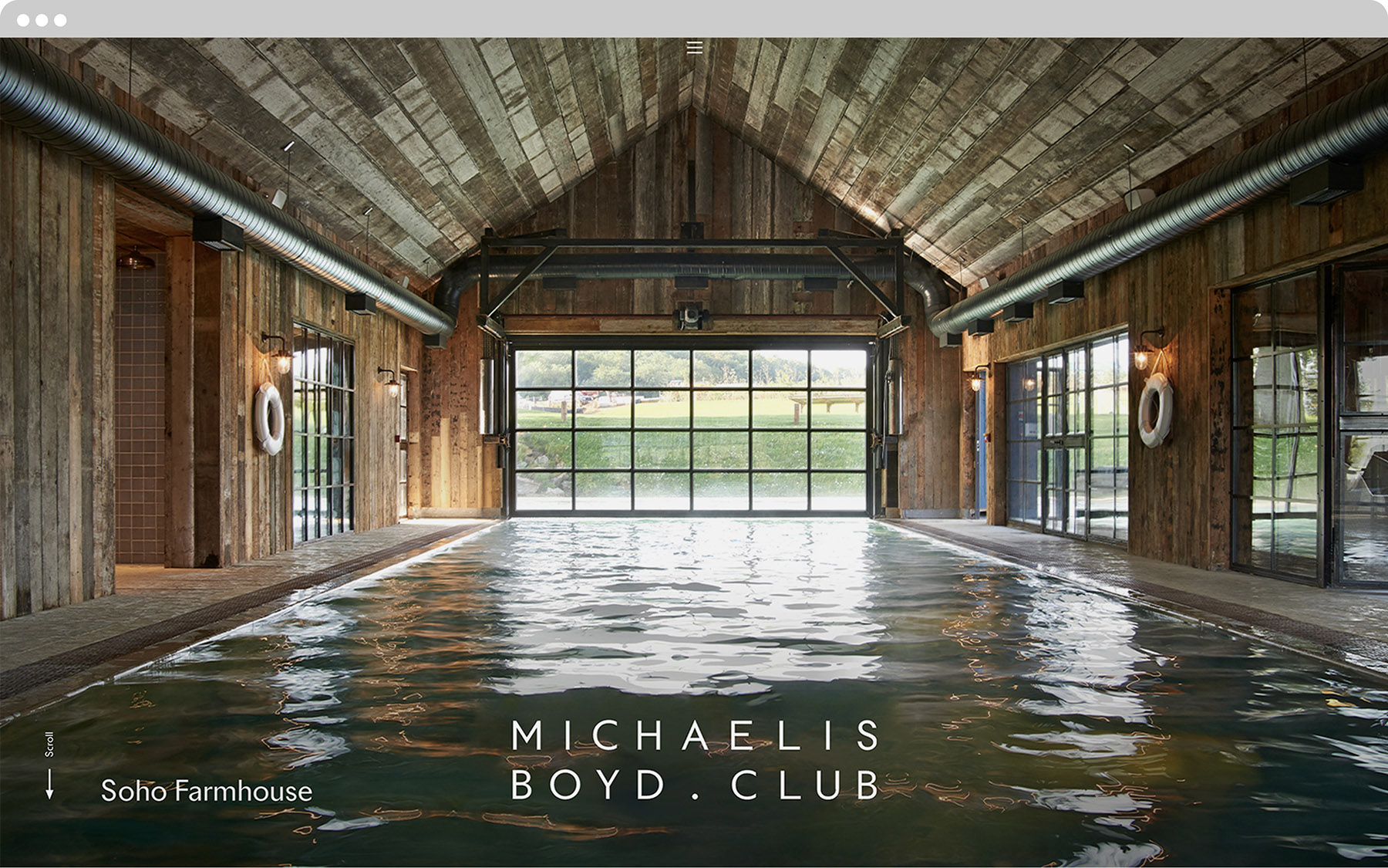
The difference in lengths of the director's names gave us the gift of being able to slot in playful 4-letter descriptions of the sectors the practice specialise in. From a colour perspective, we were driven by the boldness of the colour schemes in their own work. The suite of marketing materials, from brochures to business cards are adorned with these recognisably poppy colours. The website was built on the brand identity, with minimalism and calmness at its core. The projects were designed in an editorial way with plenty of white space to encourage delving deep into the details of each project. The website was nominated for Best Visual Design and Best Overall Website at the Archiboo Awards.
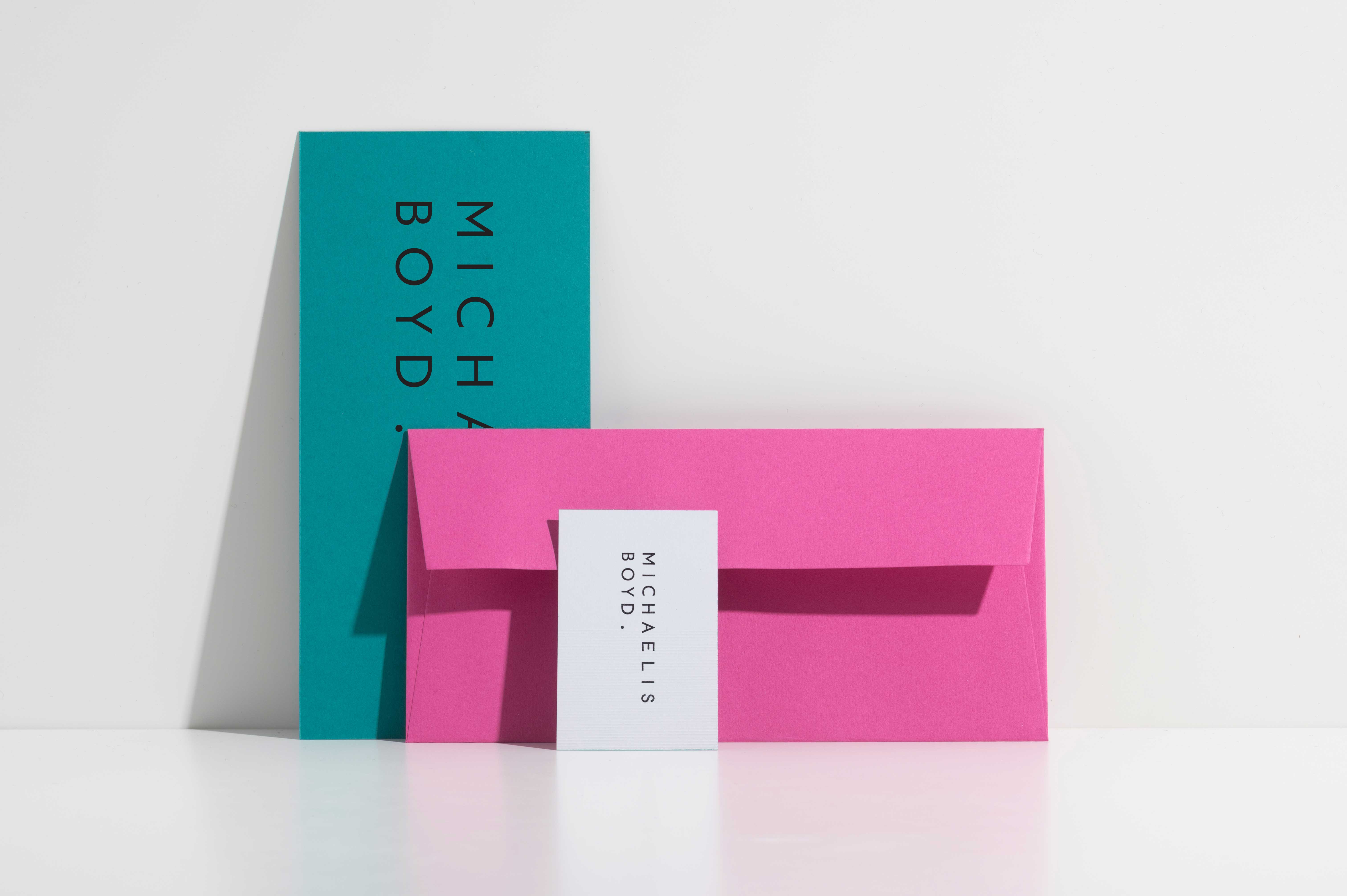
The logotype addresses issue of parity and visual balance between the directors surnames.
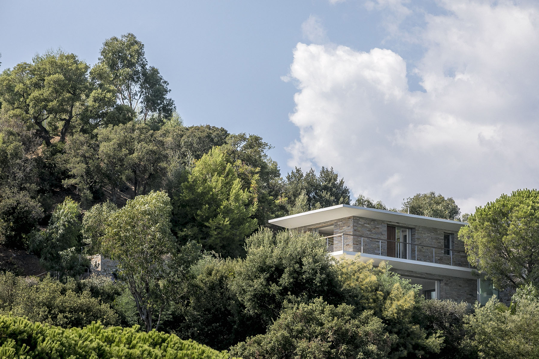
A Michaelis Boyd residential project, Hillside Home in Var, France. Photography by Taran Wilkhu.
The logotype addresses issue of parity and visual balance between the directors surnames.
Four letter sector titles neatly complete the identity going parity to the overall composition.
Four letter sector titles neatly complete the identity going parity to the overall composition.
Multiple custom template sections allow the Michaelis Boyd team to effortlessly compose different case study styles.
Multiple custom template sections allow the Michaelis Boyd team to effortlessly compose different case study styles.
Considered micro interactions, like the loading logo, give users of the website visual feedback as they browse.
Considered micro interactions, like the loading logo, give users of the website visual feedback as they browse.
A comprehensive brand guidelines system aids the internal communications team.
A comprehensive brand guidelines system aids the internal communications team.
The identity was rolled out consistently across a variety of printed touchpoints.
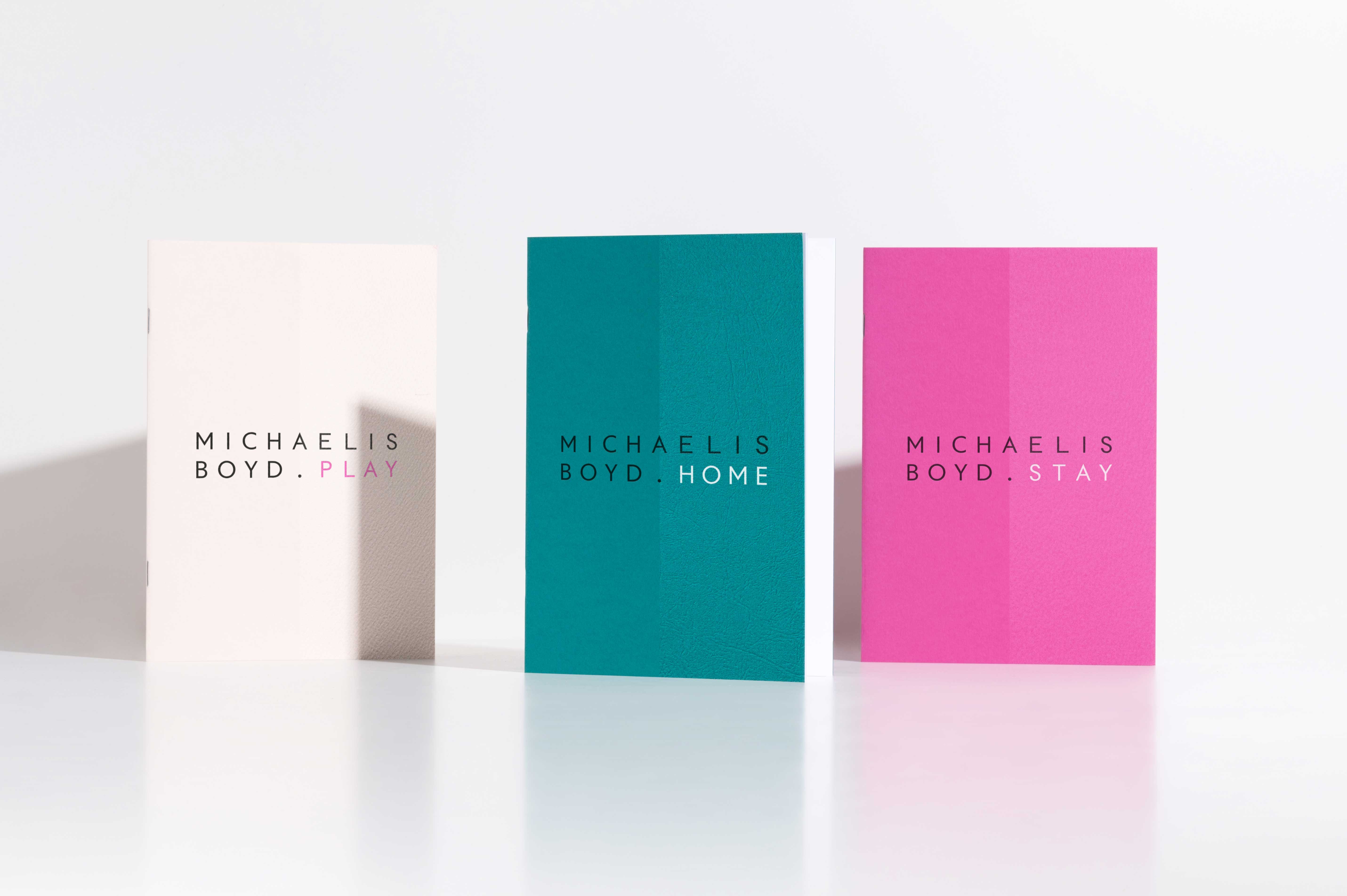
Sector titles neatly complete the identity on the cover of a series of brochures.
A blind embossed texture adds emphasis to unique logotype qualities.
Portraiture art direction, two poses for each team member injects a sense of personality. Photography by Taran Wilkhu.
Portraiture art direction, two poses for each team member injects a sense of personality. Photography by Taran Wilkhu.