Gruff
Working with this South London architecture practice to define a new brand identity that was inspired by the playful touches found in their architecture.
Sectors
Disciplines
Year
- 2018
Based in South London, Gruff had a brand identity that didn’t reflect the aesthetic of their work, nor did it present their projects in the best light.
Through a series of discovery meetings and interviews we got to know the team, who they were as people and importantly, what made them tick as architects.
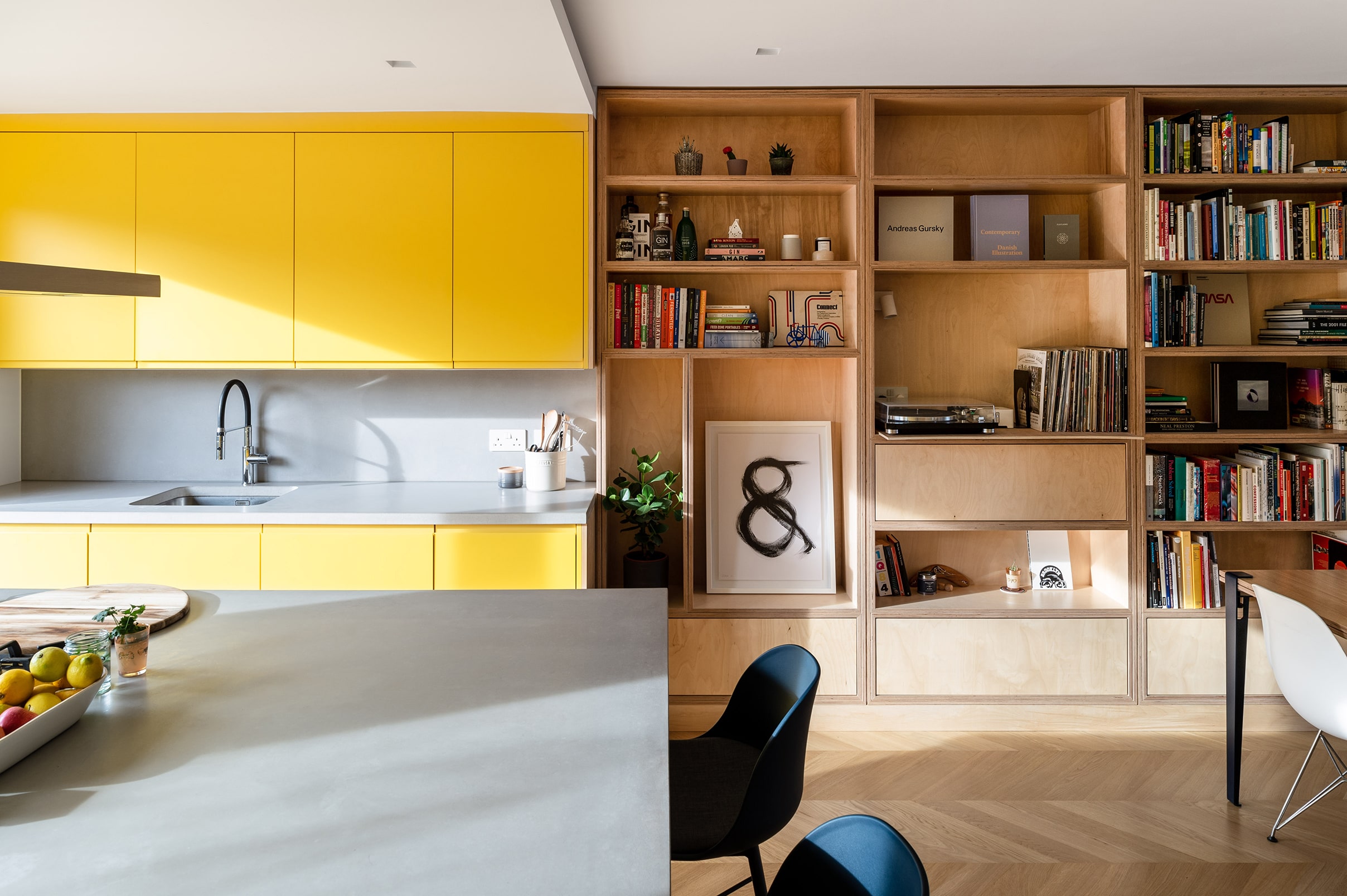
We were particularity inspired by the story of Rhys' slip house that featured a design motif derived from the plot and the turning circle on the driveway that was reappropriated throughout the building in various guises. A phrase, uttered by many members of the team, neatly summed up this approach to design: 'a playful sense of discovery'.
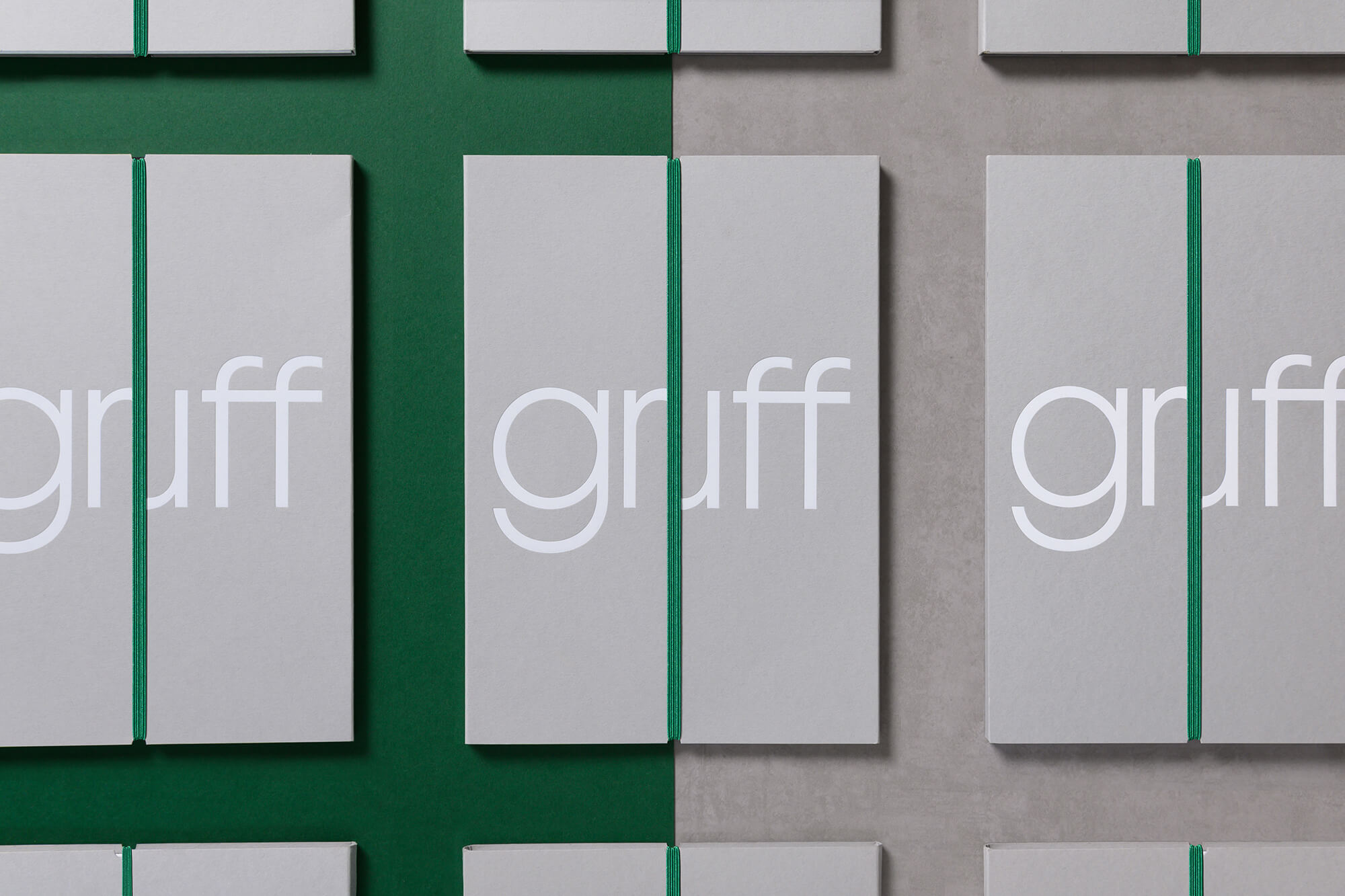
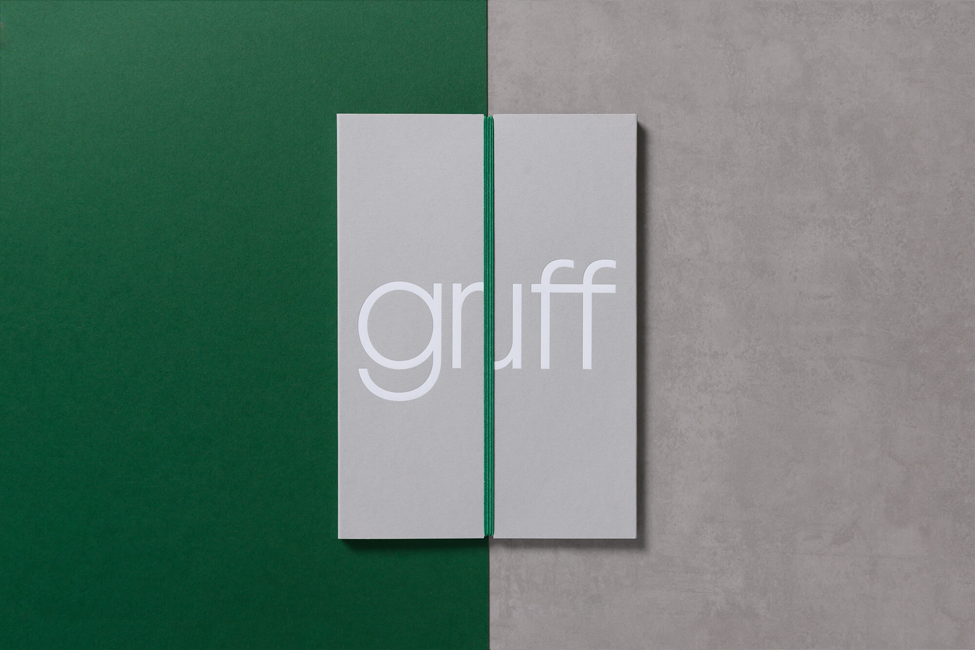
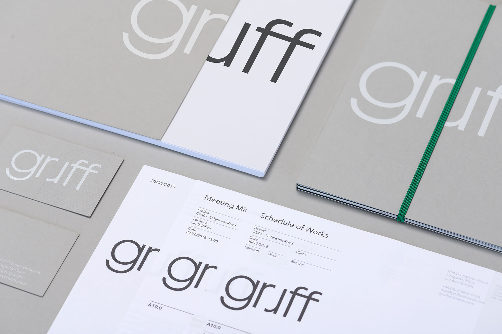
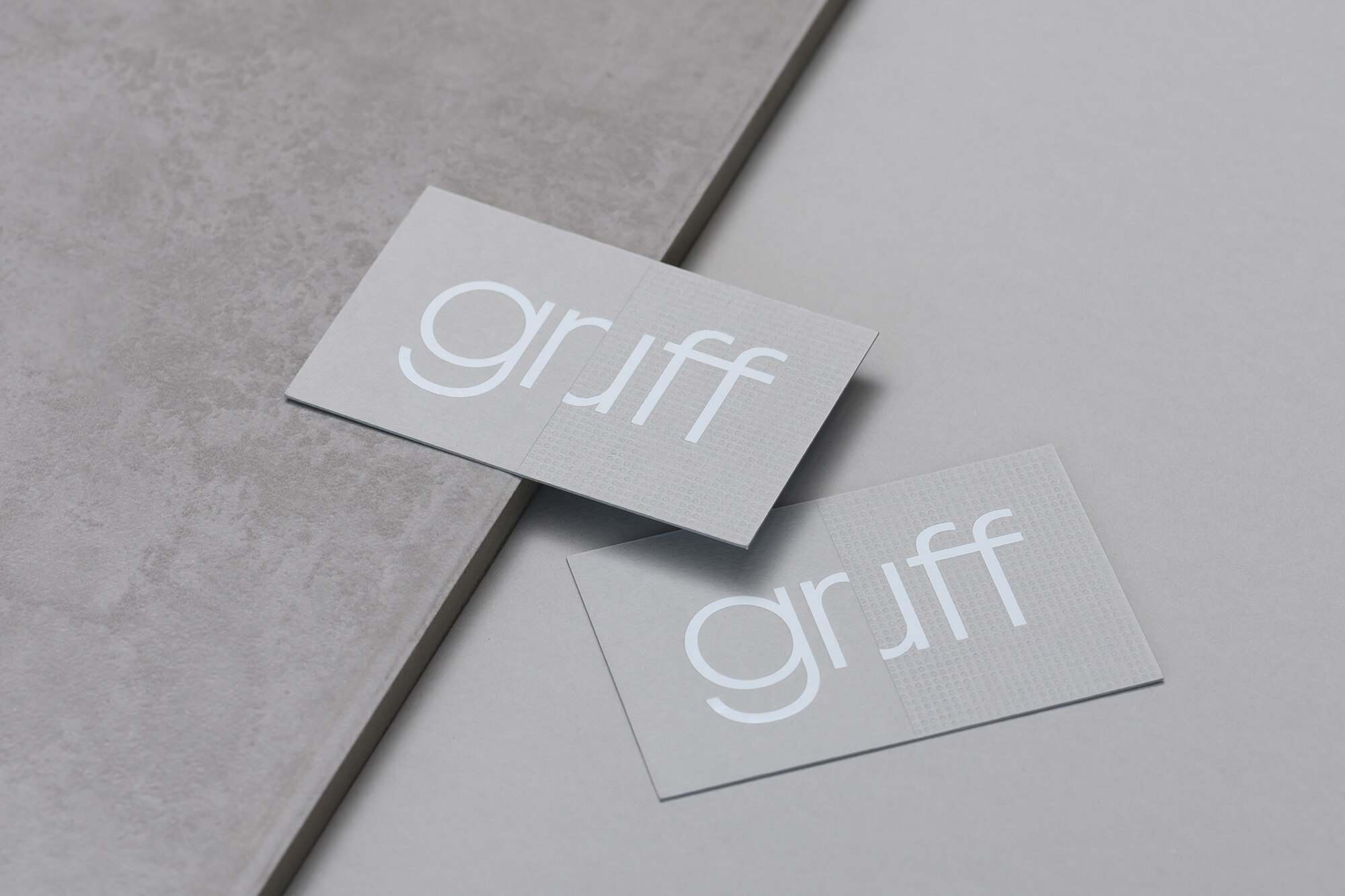
We wanted our resulting design work to articulate this approach, while maintaining an overall professional a trustworthy aesthetic. By repurposing and rotating the ‘r’, we were able to create a cut-off ‘u’ and in turn infer 'a playful sense of discovery'. This also provided us with a graphic language through the use of a 'split' device, which was carried through all touch points.
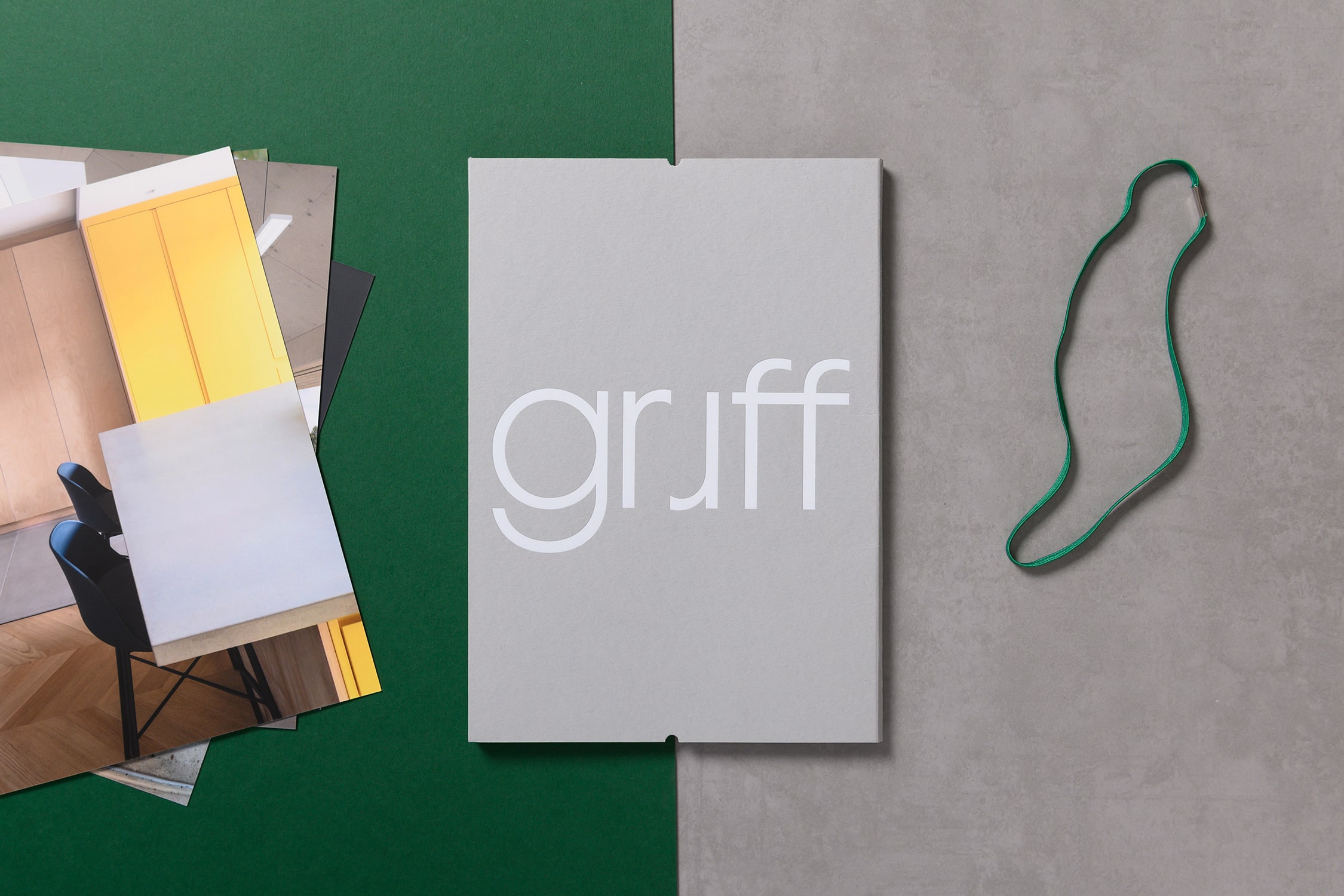
We created a suite of both digital and printed assets allowing the practice to create professional marketing materials economically and consistently.
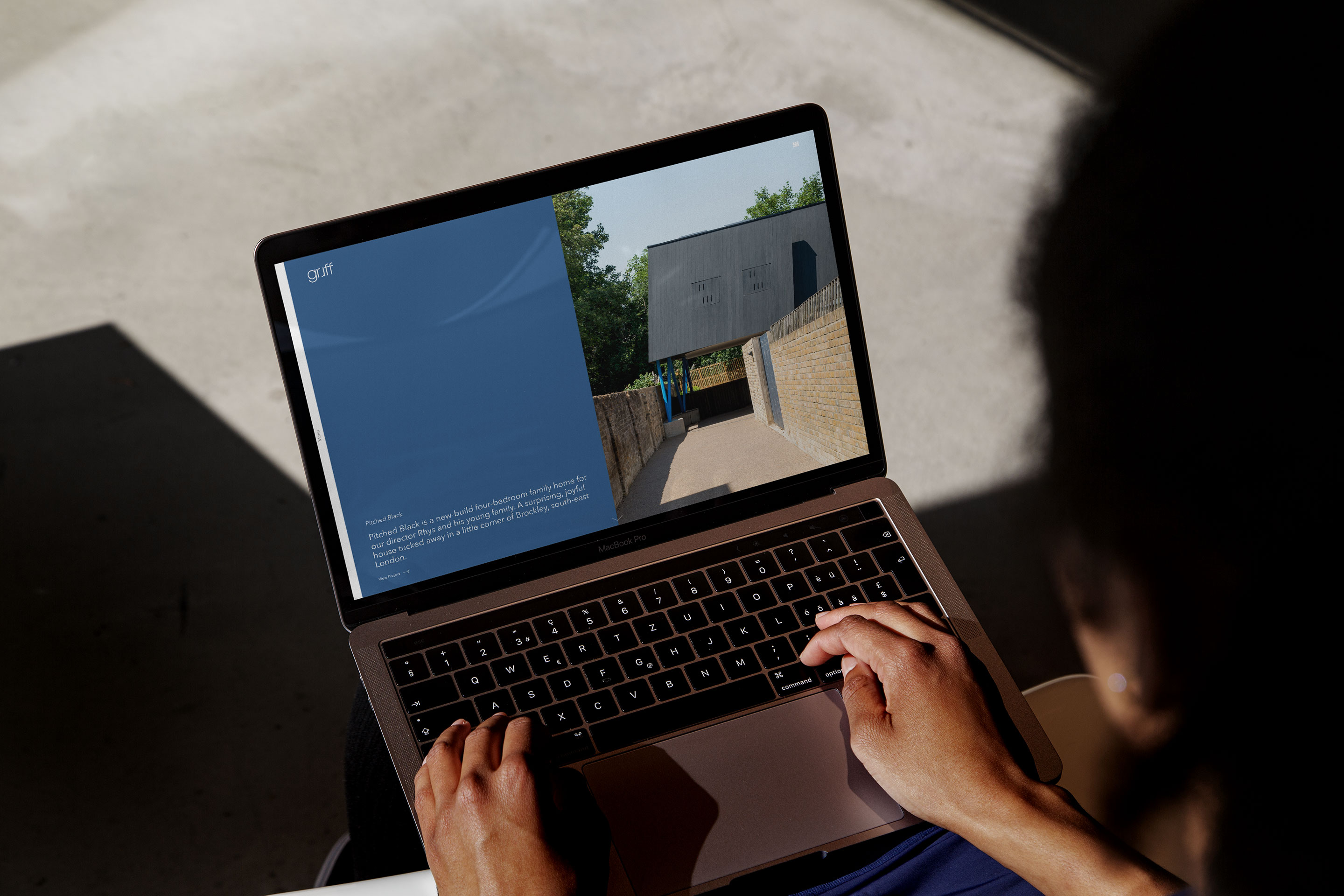
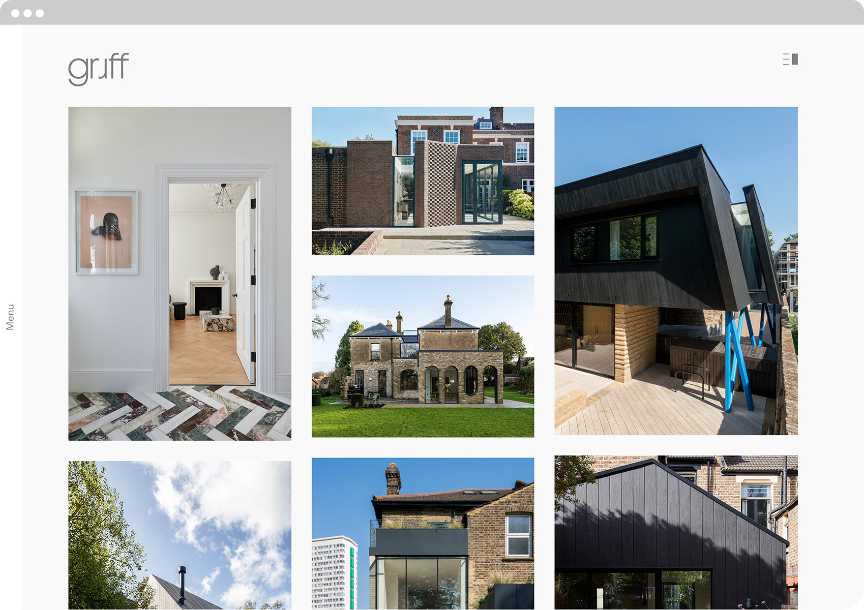
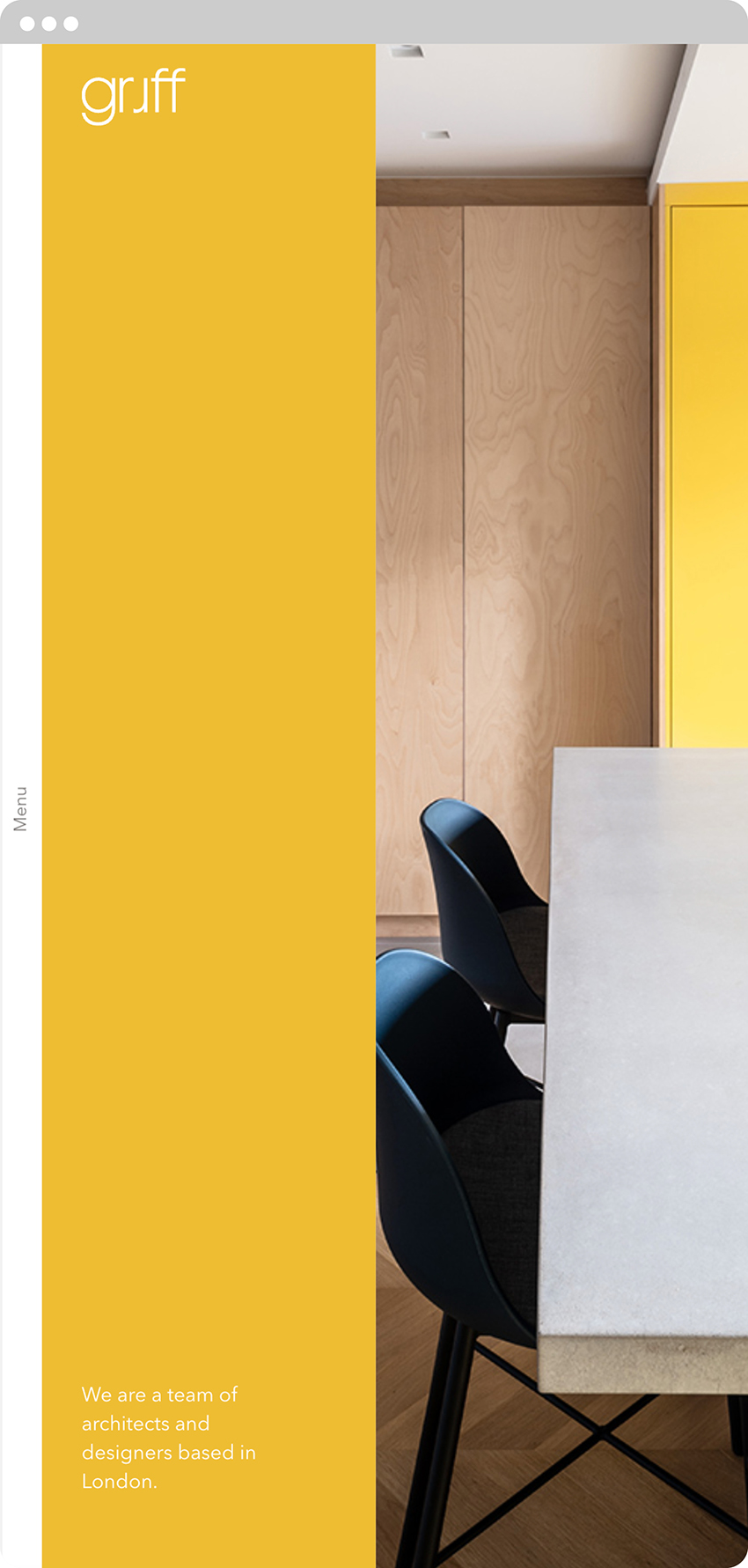
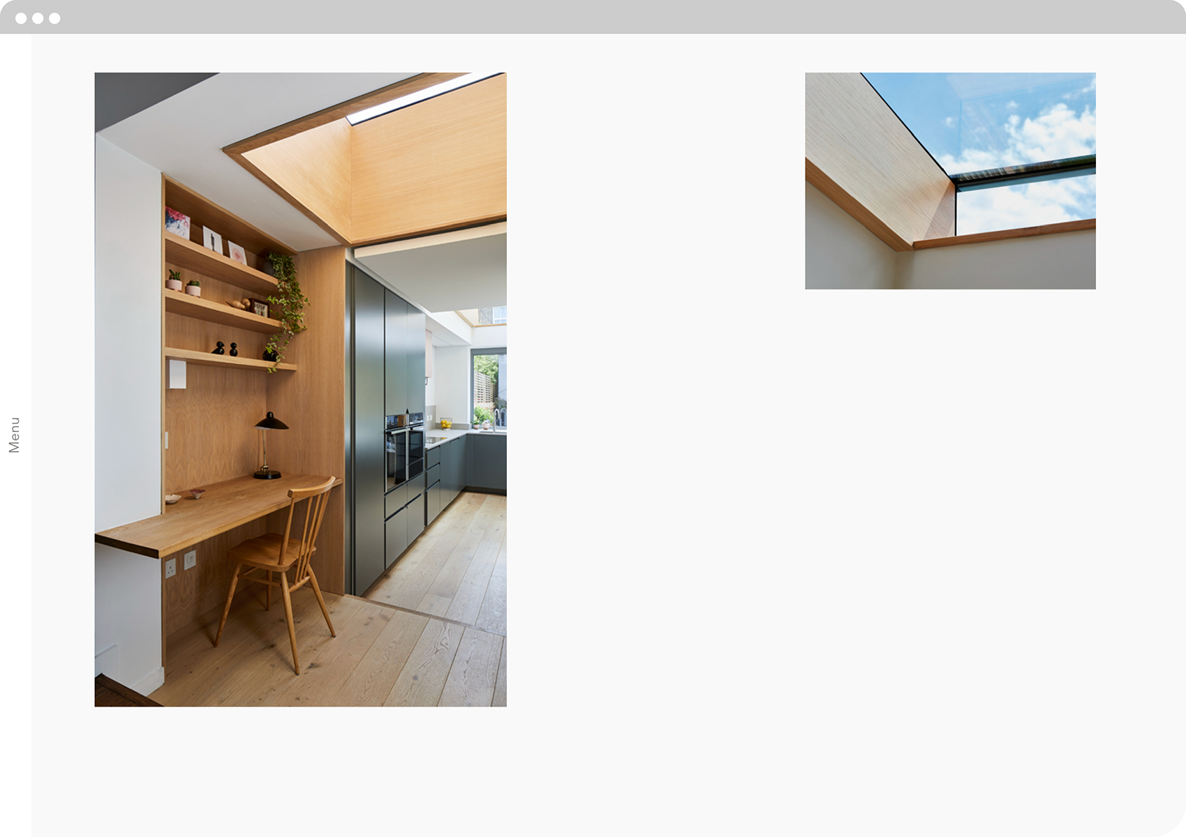
The website won Best Overall website at the Archiboo awards, with the judges remarking that the website made the practice 'look bigger than the sum of its parts'.
A typographic interpretation of the practice's 'playful sense of discovery’ embodied in their work.
The logotype informed layout of the website, with a graphic split device running throughout the pages.
The logotype informs the entire identity system across every touch point in both print and digital.
